Improving the RUI - the Road User Interface
The great thing about travelling, I've always thought, is that it makes you realise what you've always taken for granted at home. Do light switches go up or down to turn them on? Or do you press them in so that a timer can pop them out again when you're halfway up the stairs?
One thing I noticed when first visiting the States was how much text is used on road signs compared to here at home. We tend to assume that symbols are better and so will create some complicated series of hieroglyphics to indicate that the road narrows and then turns left, while an American sign would probably say "Road narrows then turns left".
Symbols do have an advantage if drivers are illiterate, dyslexic, or foreign. And they usually take less space. But they need to be used well. Here's a sign I pass regularly which, I find, takes some thought:
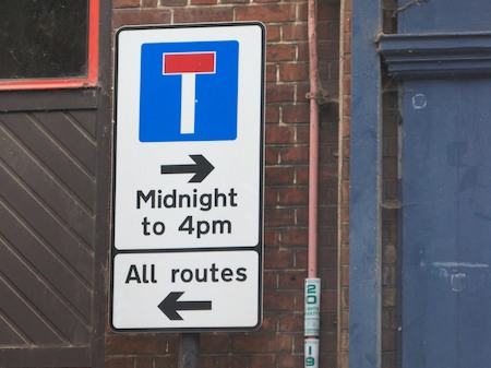
It faces you as you come to a T-junction, so you at least have time to contemplate it, which is fortunate - it would be more challenging at speed!
For me, as I suspect for many people in this situation, the question I am asking is 'Can I turn right?'. To the right is a useful route that takes you away from the crowded centre of Cambridge where you've just been parked. But it is blocked, a little way down, by bollards which let traffic either in or out of town at different times of day. So what this sign says is that you can always turn right or left, but turning right will lead you to a dead end at certain times. Fine.
However, if you arrive just after lunch thinking, "Can I turn right?", you see the arrow pointing that way, you see the times, you work out whether you are in that midnight-to-4pm slot and then you think "Hurrah!", before realising that you've worked out the times when you're not allowed to do that.
I don't know, maybe it's just the way my brain works that's strange. Or maybe it was designed by some local logicians to keep people like me on their toes. I think it's a Microsoft road sign. Lots of different ways to do things and some of them unnecessarily complex.
How would Apple design this? I think the sign would just have a single elegant left arrow. They'd say, "Sorry, that's the only way you can go. No right-button clicks here. I know that seems restricting, but trust us, it's for your own good. And doesn't this sign look beautiful?"