Monthly Archives: November, 2010

Tweetiquette?

Here’s a question for the socially-sensitive internet denizens of today:

Is it bad form to ask people to retweet your post?

I see plenty of tweets with ‘Please RT!’ on the end, and it seems… well… a bit off to me, but what’s more, it implies that the content doesn’t have sufficient merit of its own to inspire you to do this…

After all, we wouldn’t send out emails saying “Please tell all your eligible friends how good-looking I am!” or “Please vote for my brother’s political party!”. At least, not if we’re English.

So where should we draw the line? At what point is it impolite to tell people that they should really think the same as you do, and that they should tell their friends to do the same?

Or did I just spend too much of my youth reading Debrett?

Feel free to add your thoughts in the comments!

Traditional grid system

One of the monthly invoices I get by email (from those nice people at VoIPtalk) starts with:

Please view this with a fixed-width font.

And indeed, all the columns line up much more tidily if you do that, but come on, chaps, times have moved on! Even people like me are no longer using Pine to read their email, and you can bet that the vast majority of your customers won’t even know how to set their email reader into a fixed-width font.

Ironically, if you want people to view your message in Courier nowadays, you probably need to send it as HTML!

Against the grain

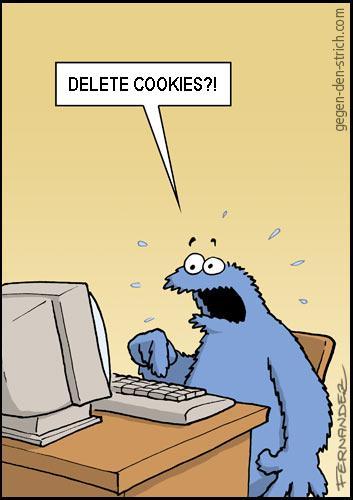
Just discovered Miguel Fernandez’s site, Gegen den Strich, which, if my decidedly rusty German is to be trusted, means ‘Against the Grain’.

Miguel is a cartoonist, and, though the site is in German, a fair selection of them will work across linguistic boundaries. I like these:

This is one of his, but doesn’t appear to be on his site at present:

Thanks to Nick van Someren for the original link.

Not to be mist II

Not to be mist

There have been a couple of beautiful autumnal mornings in Newnham recently.

More misty pics here.

Take that, Powerpoint!

Dennis Dutton’s TED talk on an evolutionary theory of beauty is very interesting in its own right, but it’s also illustrated by Andrew Park in a phenomenally clever way.

This is about as far from slides full of bullet points as you can get. Wonderful stuff. Worth watching full-screen…

© Copyright Quentin Stafford-Fraser