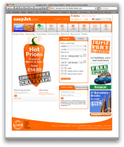
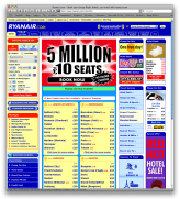
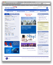
I’ve just been comparing the web pages of a few airlines. See if you can tell, even without looking closely, which are the budget ones.
The last one – RyanAir – is, I’m sure you’ll agree, quite ghastly. It’s the only major site that makes the early days of MySpace look good. So my question is:
- Do people who work for RyanAir have no taste? or
- Do they assume that customers for their services have no taste? or
- Is adrenalin more important than aesthetics when making a budget purchase? or
- Do you have to look cheap to persuade people that you are cheap?
Your thoughts welcomed….
> RyanAir – Do they assume that customers for their services have no taste?
Pretty much. They were playing Bingo over the PA on the last RyanAir flight I went on. But hey, if it means a cheaper flight, I’m all for it. RyanAir have always worried about every last penny. They make their flight attendants pay for their own uniform and training. And you can forget about making your seat lean back 😉
Have you ever been on a RyanAir flight? It feels just like a large (cheap) bus…
Maybe they spend less on designers so they get a cheaper-standard? Certainly I really dislike sites that are poorly designed.
I think this is all a part of the direct marketing theories. It’s actually remarkable how these terrible websites actually get perhaps not particularly web-savvy folk to part with their cash. It’s as nasty and cynical as an awful lot of advertising and PR is.