Generally I’m a fan of the Liberal Democrat party here in the UK. Have voted for them on numerous occasions, in fact, though I can’t remember whether I did last time. But I do wish they wouldn’t resort to such nefarious tactics.
Here’s a cheery letter that just came through the door from our MP, Ian Sollom:

Let’s take a look at that bar chart in the bottom right corner:
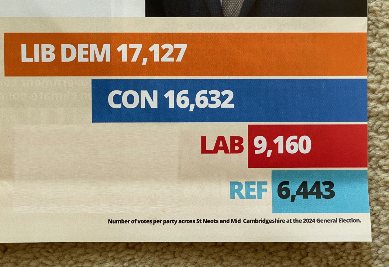
Basically, it (and the tone of this and other newsletters) is clear: our only close competition in this area was the Conservatives, and Ian gave them a damn good thrashing! Hurrah!
But look more closely at the actual numbers, and you’ll see that the Conservative vote was actually over 97% of the Lib Dem vote! Is that what this chart says to you? And Labour got more than 50% of the Lib Dem number. Don’t get me wrong, I’m still glad they won, but this chart is deliberately misleading – somebody created this, and made a choice to falsify the dimensions.
With the help of a bit of photoshopping, I can show you what the chart should look like to represent the facts accurately:
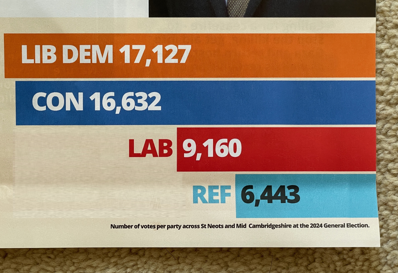
That looks less like a ‘damn good thrashing’ and more like ‘by the skin of our teeth’!
It wouldn’t surprise me to hear that Mr Sollom isn’t the only one guilty of similar mathematical fraud. I wonder if the Advertising Standards Authority take any interest in political campaigns…
I’d have thought that graph is self-defeating too, as they should be saying “We only just beat the Tories, make sure to vote for us again!”