Back in contact
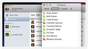
 After my recent post about how much I liked Skype, and how much I disliked what they'd done to the Mac version recently, it seems only fair to point out that the worst aspect of the redesign - the amount of desktop space it takes up - has largely been fixed in the latest version.
There's now a 'Contacts monitor' window, which you can tuck down the side of your screen as in the good old days, and get rid of the main window (at least until you're actually in a conversation).
I still don't think version 5's layout is as good as 2.8's, so I'm pleased that they still give you the option of using that version, but, with a bit of tweaking, it comes close. I'm also willing to believe that there may be improvements under the hood that are worth having. And it also looks as if they're listening to their customers. So I've upgraded my machines.
Comments
Leave a Comment