Skaters’ Meadow

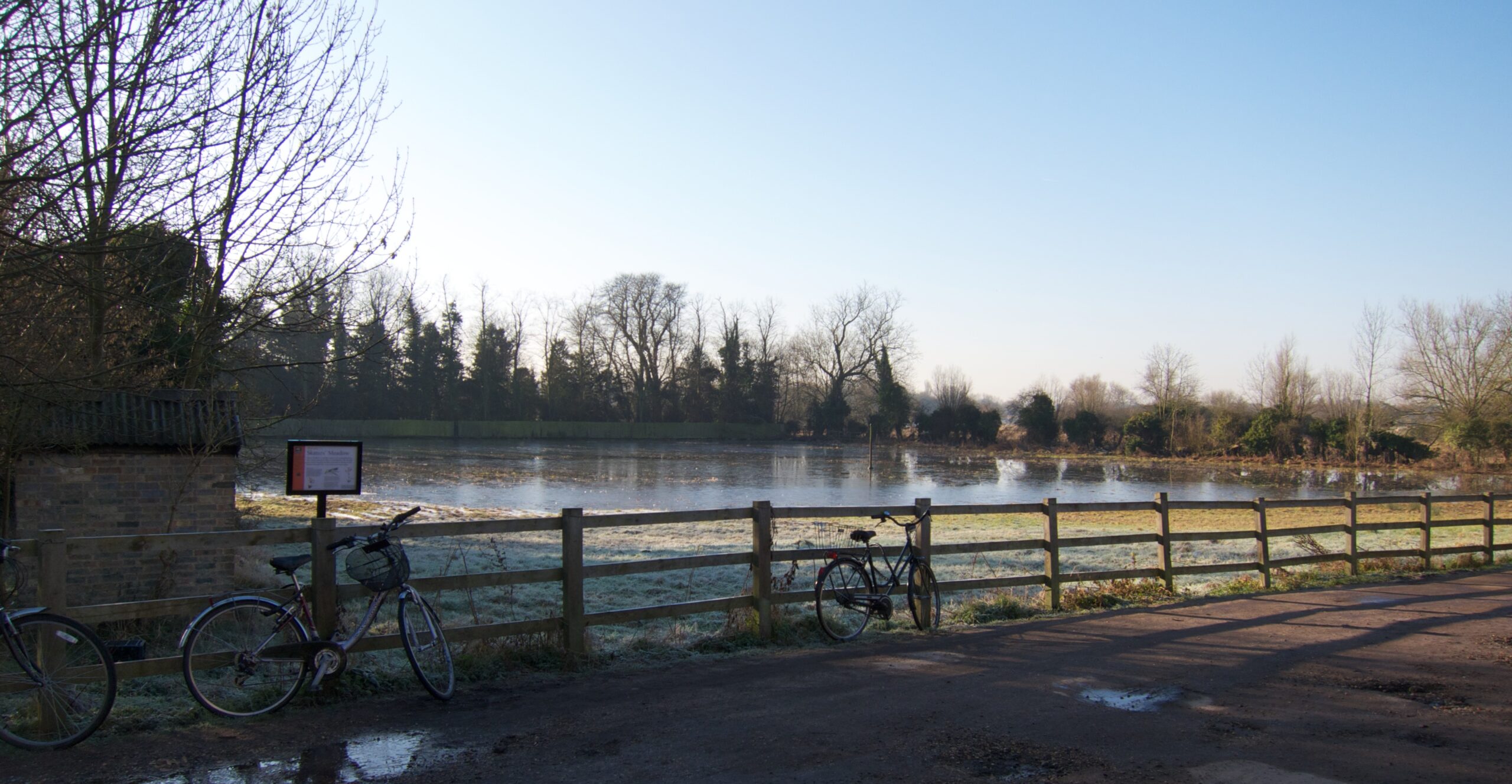
Just around the corner from my house, where the footpath from Cambridge to Grantchester begins, is Skaters’ Meadow. In the 19th century, the meadow would flood, freeze, and people would pay a penny or two to skate around the lamppost in the middle (which you can just see if you click it and look at the larger versions on Flickr).

These days, it’s managed as a nature reserve, and is no good for skating, partly because the winters aren’t cold enough any more, but mostly because it very seldom floods. So I snapped this picture after some heavy rain last week; it’s the nearest I’ve yet seen it come to being a skating rink again. There was a little ice around the edges…

Wouldn’t it make a great setting for a story, though?

On wintry nights, it is said that the ghosts of skaters past can sometimes still be glimpsed, twirling under the lamppost in the moonlight. The most beautiful, and the most graceful of all, is young Annie Crompton, a maid at one of the great houses nearby, who mourns the loss of her love, an adventurous lad who skated too far out onto the River Cam, fell through the ice and drowned. She circles endlessly, awaiting his return…

More photos of the meadows here.

Enjoyed this post? Why not sign up to receive Status-Q in your inbox?

4 Comments

Are you starting to compete with Rose? 🙂

I don’t know about competing with Rose, but you do seem to be channelling M R James (perhaps appropriately enough, given your location).
Lots of interesting info, as ever.
Apologies for being O/T again but also dropped in to comment on the first volume in Rose’s fictional series, which I’m just finishing. Tried her site, but a bit daunted by the log in process – ie = private? Anyway.
The book’s a very entertaining and absorbing read. It’s written in elegant prose and goes at its own, comfortable pace (a perfect match for the period setting!), ensuring from the start that the reader is provided with a strong sense of time and place. I love the deft fashion that Rose marshals what could be irksome amounts of detail, making it enriching rather than distracting. In this manner, she brings to life not only people and places but also the politics & social structure of the day. Each character is clearly delineated, fleshed-out as it were, and the fact that the POV (an ‘omniscient’ one, technically speaking) shifts contributes depth as well as irony. There’s a fair bit of humour, which arises naturally from character/events – just as it should. Only cavils are minor ones, eg an ‘I guess’ creeps in and jars a bit. A good copy editor would have picked this up; but good copy editors are mostly unemployed, these days … And the cover reeks of Victoria Holt: what on earth is a comparatively mature, early 1960s model doing sporting an early 1970s ballgown on what looks suspiciously like Beachy Head? The White Cliffs of Suffolk …! But I know authors have no say in the packaging of their own products – more’s the pity (they are the brand owners, after all).
Bon weekend to you, Rose – and Tilly, of course!

Hi Minnie – thanks for the kind words!

I share your concerns about the covers – they’re quite striking but I don’t think it’s Mary Finch. And actually, the problem with the dress is not that it’s 1970s but that it would be valid, if I remember rightly, for something like the 1770s, and not for the 1790s, by which point they were looking much more Pride and Prejudicey.

Rose also complained that Mary would not have possessed such a dress before gaining her fortune, and in the immediate aftermath she would have been in some degree of mourning anyway… so certainly wouldn’t have been wearing that colour. But one can only protest so much. And they did, for example, take Rose’s advice on a proper 18th-century typeface for that edition.

Ironically, it’s some of the lesser editions that do the most historically accurate covers. This one was produced by a German book club, for example, and shows a dress of the right period, as does the Italian edition of book 2. But in any case, it’s fun to look at the different covers used in different editions of the same book in different markets. We haven’t seen the Polish one yet…

You might like the French flavour of book three, out at the end of the month 🙂

Ah, yes, Quentin – and spot-on: the dress should be Regency-style pre-Waterloo, and Mary should indeed be in mourning. I understand Rose’s irritation. Why can’t we have a bit of historical accuracy? Doesn’t cost any more … harrumph!
Shall look forward to the French-flavoured third in the series; have just ordered the second one.
Now I have finally noticed Rose’s email address (duh!) on the front page, I can send any further reviews/comments direct. In the meantime, thank you for your patience – and bon courage for the blogging!

Got Something To Say:

Your email address will not be published. Required fields are marked *

To create code blocks or other preformatted text, indent by four spaces:

    This will be displayed in a monospaced font. The first four 
    spaces will be stripped off, but all other whitespace
    will be preserved.
    
    Markdown is turned off in code blocks:
     [This is not a link](http://example.com)

To create not a block, but an inline code span, use backticks:

Here is some inline `code`.

For more help see http://daringfireball.net/projects/markdown/syntax

*

© Copyright Quentin Stafford-Fraser