Category Archives: Apple

The ‘Hyper’ key and Mac OS Sierra

Like many Mac geeks, I’m a fan of the ‘hyper’ key. “What”, you may well ask, “is that? I don’t see one of those on my keyboard.”

Well, you’re familiar with the normal modifier keys – shift, control, alt/option and command – and there are various utilities, both within the operating system and as third-party add-ons, which let you map keystrokes involving these onto particular bits of functionality. So, for example, if you have an application in which a particular menu item has no keyboard shortcut, you can assign one of your own using the Keyboard section of System Preferences.

You can set up more complicated sequences of events using something like the wonderful Keyboard Maestro utility (which, despite its name, can also trigger actions based on all sorts of other events, like starting an app when a particular USB device is plugged in, or mounting a network drive when you join a particular wifi network. However, back to the keyboard…)

If you want a keystroke that will perform a particular action regardless of which app you’re using, though, you may have more of a challenge. Here’s an example: To my surprise, one of the most useful things I’ve found in recent Apple OS updates on the Mac and iOS devices is the previously uninspiring Notes app. It now has enough formatting, searching and organisation to be really useful for odd notes and synchronises beautifully across both my Macs and all my mobile devices. I use it all the time, and I want a keystroke combination that will pop it to the front at any time. It can’t be Cmd-N, because that creates a new file in most apps. Shift-Cmd-N is used, for example, in the Finder to create a new folder. I might get away with Ctrl-N in many of my current apps, but one day soon I’ll install one which uses it and then I’ll be frustrated.

So the idea of the ‘hyper’ key is that you pick a combination of modifiers that nobody in their right mind would ever use for anything else: typically Shift-Ctrl-Alt-Cmd. And then you remap some otherwise-unused key on your keyboard to produce Shift-Ctrl-Alt-Cmd, and that becomes your ‘hyper’ key. Hyper-N fires up Notes, Hyper-C brings up your diary, Hyper-T your todo list, and so on, and they work in any application because no sane application is going to have defined Shift-Ctrl-Alt-Cmd-T as a shortcut.

In the past, the best way to do with was with a little utility called Karabiner. It had an option to use the ‘Fn’ key for this, without interfering with its normal operation when pressed with, say, the volume keys. I’ve used it for years. But at present Karabiner doesn’t work with the new Mac Os Sierra, and I find I’m missing my Hyper key terribly. There’s a lightweight utility called Karabiner Elements being developed, but it’ll currently only map one single key to another, and won’t do the more complex stuff I need for this.

So I was pleased to come across this article by someone calling themselves ‘LunarRed’ which suggests a solution: you use Karabiner Elements to map the CapsLock key to F18, and then Keyboard Maestro to map F18 plus another key to the actions you wish to invoke.

It works nicely, and with a small reprogramming of my fingers, I can pop up Notes with CapsLock-N, my To-do list with CapsLock-T, and so forth. Happy again…

Update 5 Dec 2016 – Karabiner Elements is starting to get proper ‘Hyper’ functionality built in now. At the time of writing it’s not in the official build, but I’m using a version from this thread and it works fine. I’m changing one thing, though: in the past I always used the Fn key for my hyper key, but you need an app that understands that, despite this, you probably want Fn to do its normal thing if you use it with the function keys. Karabiner did that, the new Karabiner Elements doesn’t (yet). So I’m going to switch all my machines to use Caps Lock as the Hyper key, since that has few complications, and my fingers will gradually learn the new location!

Aiiii! Tunes

When cloud services go wrong, they can go badly wrong.

For many years I was a happy user of iTunes, iCloud Music Library, iTunes Match and so forth. They kept my music nicely in sync across all of my devices.

But at some point over the last year, the rot set in.

I think this may have coincided with the Apple Music trial, I’m not sure. But the metadata in my iTunes library has started to become corrupted in a way that’s proving quite hard to fix.

Here’s an example. At some point in the past, I ripped my CD of Count Basie. Let’s take a look at it now:

Screen Shot 2016-01-13 at 20.13.42

You notice that I have three different copies of ‘Red Wagon’. All supposedly from the same album, and all of different lengths. The first one is actually the inimitable Count. The second turns out, when you play it, to be ‘New Hope Blues’ by George Winston. The third is ‘Green Light’ by Cliff Richard.

Now, I own, and like, all of these, and they all still play, but the metadata is all confused, so you don’t know what you’re about to get. And it’s a big problem – there are about five or six thousand tracks in my system, and it feels as if about one in four suffers from this. The worst thing was when I thought I was about to listen to some Flanders and Swann and got chunks of Les Miserables instead! You can imagine the shock. (I thought I had banished the latter…)

I think this may result from my iCloud Music Library becoming corrupted, and the tracks then getting synced down from there with the wrong embedded metadata. Or maybe it was something else, but it crept up over many months, perhaps even a year or two, to the extent that I can’t just go back to a known previous backup and assume all will be well. It’s not just in the database, or I would simply throw that away: it has been written into the music files on disk too.

Apps like MusicBrainz Picard can scan and identify tracks and help fix this, but it’ll be quite a job if it really is a thousand tracks or so that I need to check. And while Picard can identify the track, it often can’t tell which album it should be part of, and so I end up with lots of single tracks in compilation albums called ‘Sweet Sounds of the 60s’ or some such.

Not quite sure what to do.

Maybe this is the time to embrace the new and expensive world of Spotify or some other streaming service, where I’d be paying for the rest of my life if I wanted to keep listening to music, but where somebody else would manage it.

Or, I could discard everything, re-rip all my CDs and re-download all my purchases. Time-consuming, but perhaps the best option. Thankfully, I haven’t yet quite discarded physical media…

Macs are expensive, but…

IBM has started allowing their employees to use Macs, as reported in this piece by Daniel Weber.

Previn says that Gartner believes the optimal number of IT to employees should be 1:70. Previn noted that the average is 1:242. And IBM is currently hovering around 1:5,400 for their Mac users.

Streaming the classics

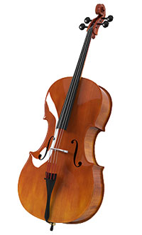
celloI’ve never yet paid for a streaming music service. I greatly enjoy music, but seldom listen to much these days, and when I do, it’s generally in the car, where such services are normally of limited use. At home, I can’t really listen to music and get any work done at the same time, though I sometimes try to persuade myself otherwise. And when I’m not working, I’m more likely to be listening to podcasts or audiobooks.
Also, the typical subscription for such services costs about the same as buying a track every 3 days, which is probably more than I typically spend, and if I did, I would then own the music indefinitely and not just for as long as I kept paying. So Spotify, Last.fm and all the others have not, so far, been for me, any more than Office 365 or Adobe Creative Cloud.

But the chance to play with Apple Music during its three-month free trial has persuaded me that I might be tempted to change my mind, and not just to get more access to Sting, Paul Simon or the Wailin’ Jennys, nice though that is. No, what I’ve been enjoying this weekend are the classical playlists, which I can enjoy while working, or at least while writing blog posts. This comes to you from my sofa, accompanied by some delightful Chopin, which sounds rather good played from my laptop via some AirPlay jiggery-pokery to my Sonos amp and KEF speakers.

This makes a bit more sense to me, because if I hear a song I like on the radio, I’m likely to pay the 99p or so to own the definitive version, but if I hear a Schubert sonata, how many albums will I need to purchase to find out whether I prefer the interpretation from Barenboim, Brendel, Paul Lewis or one of the dozens of other options?

I seldom listen to classical music in the car – I think you need a quieter car than mine for that to work well – but a streaming service might persuade me to listen to rather more at home.

If you’re switching to San Francisco…

“The well-dressed man”, said Somerset Maugham, “is he whose clothes you never notice.”

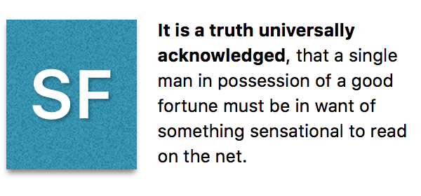
In the upcoming releases of Mac OS X, iOS and watchOS, Apple is changing the standard system font — used in widgets, menus, etc — to a new typeface created especially for the purpose, named San Francisco.

SFfont

I think it’s very simple and elegant, and will work well, but, in most situations, typefaces are successful if you don’t notice them. Occasionally, however, it’s intriguing to see what goes on behind the scenes when a type designer sets out to create something that we should appreciate but not actually notice.

This talk from Apple’s WWDC shows that there’s a lot more involved in the creation of something like San Francisco than you might suspect.

Screwed in a quiet place

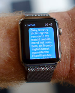
2015-06-05_08-53-25-03This morning I composed a longish message to my nephew, James, by dictating to my watch – a procedure that worked beautifully. There then followed a brief discussion on the quality of speech recognition. I turned to my Mac – because, of course, iMessage conversations are synchronised across all devices – and I continued dictating. “It’s good in a quiet location with a good network connection!”
Sadly, this time, I did not enunciate the first couple of words quite so clearly, and the Mac cheerfully recorded, “Screwed in a quiet location with a good network connection!”.

Which might have conjured up all sorts of interesting images at the other end.

Still, I guess that’s just what they call ‘social networking’.

Now, had I instead sent the message, “It’s god in a quiet location with a good network connection!”, it would still have been amusing, but understandable, in these days of careless typists and small keyboards. It’s something we’ve adapted to, like illegible writing in the past. But, as I have a rapidly dwindling number of electronic devices in the house that do not at least claim to understand speech, I wonder when our ability to understand speakos will become as well-developed as our ability to interpret typos…

In Google we trust…

Marco Arment writes about why he’s reducing his use of Google products:

…the reason I choose to minimize Google’s access to me is that my balance of utility versus ethical comfort is different. Both companies do have flaws, but they’re different flaws, and I tolerate them differently:

  • Apple is always arrogant, controlling, and inflexible, and sometimes stingy.
  • Google is always creepy, entitled, and overreaching, and sometimes oblivious.

How you feel about these companies depends on how much utility you get out of their respective products and how much you care about their flaws.

Simply put, Apple’s benefits are usually worth their flaws to me, and Google’s usually aren’t.

I’m a fan of both companies, though if I had to choose between them for some reason, I too would pick Apple, both for the quality of the product and the cleanliness of the business plan. (My favourite Google product, though, which nobody else can yet match, is Street View.)

Back when Gmail was the hot new thing, and because it was free(!), I started using it as a backup for my email. I never actually use the web interface, but my other accounts forward incoming messages there, where they get filed immediately into the archive. This guards against losing too much in the event of the complete annihilation of whatever other email provider I’m actually using at the time. (Like Marco, I’m a very happy user of Fastmail.) I set up this system 11 years ago, and really haven’t had to think about it since: it’s probably the most painless backup solution available!

It does mean that Google have over 100,000 of my recent messages with which to analyse everything about me, though, and I wonder whether that trade-off is worthwhile now that my entire email archive – of which they only have half – would fit happily on a small USB stick….

My first Apple Watch accessory

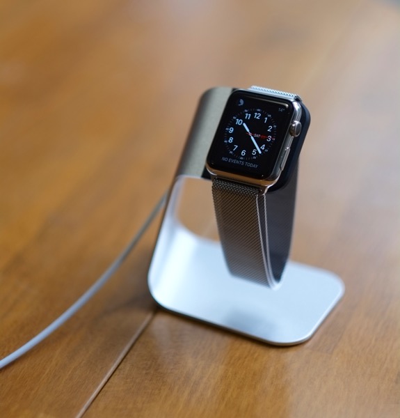
watchstand-600

The standard Apple charger clips into this Spigen charging stand. Works nicely for me.

Wrist recursion

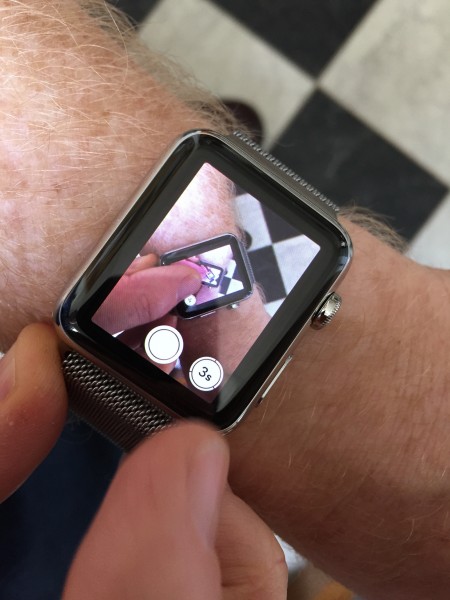
My new watch can be used as the viewfinder for my iPhone camera. So, of course, the first thing it wanted to do was take a selfie.

IMG_1981

There’s a slight delay in the image, and in the shutter release, which means that the shot the camera actually took was after my finger had moved off the screen, but the image on the watch, from a second before, still shows it in place. If you click to see the full-size image, you can see a few levels of recursion (which says something about the resolution of this 1.5″ display!).

Titanium nostalgia

Just over 14 years ago, in one of my first blog posts on Status-Q, I referred to the amazing fact that Apple, with the impending launch of OS X, was about to become, overnight, the largest vendor of Unix operating systems.

Unix was, up to that point, beloved of those of us working in universities and other scientific institutions, but was notoriously unfriendly to anyone not familiar with its highly-abbreviated command language. It sold in small quantities on expensive workstations, and the idea that the creator of the cuddly Macintosh was about to start deploying it on ordinary desktops seemed astonishing. In a little over a decade it would have evolved to be not only at the core of their mobile phones, but even on their watches!

Today, I fired up the Titanium Powerbook G4, the machine I was just starting to use at about that time.

For nostalgia reasons, I was revisiting the classic Mac OS, but back then I had been playing with the developer preview of OS X for a while, and when it was officially released I switched to the Mac and never looked back. I didn’t realise that I had made quite such a transition at the time, but a few months later I wrote:

At CNET there’s a comparison of Windows 2000 vs Mac OS X which comes out in favour of OS X. I’m a bit dubious about the higher OS X score for hardware compatibility, but it’s pleasing none the less. I currently use 3 machines on a regular basis. One runs Win2K, one runs Linux, and one runs Mac OS X. They all have their pros and cons, but if I could keep just one, I think it would be the Mac. I find myself pining for it when I’m using the others and, for all its current limitations, the reverse is seldom true.

P.S. I noticed a couple of other things from those early posts. The first is that they are both called ‘[untitled]’, because the convention of putting a title on blog posts hadn’t been established back then. The second is that neither of the URLs I linked to still work now. Never assume the web is going to be a long-term reference archive unless you control the site yourself!

How to turn Apple Photos into a more powerful editor

Apple recently released OS X Yosemite 10.10.3, which includes their Photos app – the replacement for iPhoto.

This is unlikely ever to become my normal photo-management and editing tool, but it does have some nice features, and it has more editing controls than you might at first realise:

Also available on Vimeo.

The watchword

Like many other people, I’ve been eagerly awaiting the arrival of the Apple Watch. It hasn’t really arrived yet, you understand, but you can at least now see it, play with it, and plonk down large amounts of money for it, in anticipation of delivery in a month or two’s time. I spent quite a lot of time experimenting with it at the Apple store yesterday.

I must admit to being something of a watch techno-enthusiast. Back in about 1976, my brother and I were the first kids in my school to have a digital watch, and they, too, were made by a computer company, Commodore.

commodore_cbm_time

The company went on to create computers like the Commodore PET and the 64, but, unlike Apple, it made a watch before it did computers. Still, amusingly, it probably looked more like an Apple watch than any timepiece I’ve owned since, because the display used too much power to keep it constantly illuminated; the LEDs only lit up when you pressed the button. I still remember the excitement of staying awake outrageously beyond my bedtime, just so I could see the display change from 23:59 to 0:00. We bought our first digital watches on a discount offer. I think they were £13 each.

Roll forward about a third of a century, and I was an early backer of the Pebble project on Kickstarter.

wpid-Photo-17-Apr-2013-0745.jpg

I’ve worn it every day since it arrived, and I even created my own watchface for it. It’s been fun, but it’s taken the developers a couple of years to get to the point where notifications are reasonably reliable and the API is easy to use. Many people who bought Pebbles sold them soon afterwards on eBay.

However, the team deserve a lot of credit, I think, for kickstarting (somewhat literally) the whole smartwatch revolution: few people thought watches were really in demand any more until they proved, rather dramatically, to the contrary, by being the biggest Kickstarter project ever. The upcoming Pebble Time looks nice, too, and it’s worth pointing out that you’ll be able to buy it for about the same price as some of the standard straps for the Apple watches. I think it could be a good option if you want to explore this whole smartwatch thing, especially if you don’t own a recent iPhone (on which the Apple Watch depends).

The Pebble, despite its quirks, has taught me some interesting things.

One is that the wrist is a very convenient place for a user interface. Avoiding the need to take my phone out of my pocket is a great benefit; I can dismiss incoming calls in a couple of seconds, for example, if they occur in the middle of a meeting – much less disruptive. About a year ago, I did it without thinking in the middle of giving a talk, and almost got a round of applause from the audience!

Another is that I use my Pebble many times a day, but very few of those are actually about telling the time. Watches were important for that purpose in the past, when you had to keep checking them to know whether you were getting close to your next appointment. But I’ve long since relied on my devices to notify me in advance of any upcoming events, and I spend much of my time sitting in front of a screen with a clock in the top right corner, or driving a car with a clock on the dashboard. Actually looking at a watch to discover the time is probably something I do about once every other day. So, yes, I’m about to buy my most expensive timepiece ever, when I’ve discovered that I don’t really need a watch for telling the time any more.

Actually, to my surprise, my number one use of the Pebble has been to stop and start audio. I’ve described in a previous post how I listen to large numbers of audiobooks and podcasts, and I seldom do this through headphones. Being able to pause a book from the other side of the kitchen just before I start the noisy coffee grinder is exceedingly handy. Being able to do so with a couple of button presses when I’m out walking the dog in mid-winter and wearing gloves is even more so. While driving, I’ll often stop and start music this way, because reaching my wrist is more convenient than reaching the controls on my dashboard, and so on. This bit of my Pebble’s operation has always been very reliable, perhaps because it’s operating simply as if it were the pause button on a traditional Bluetooth headset. As with every device, in my experience, it’s when you start doing complex Bluetooth LE stuff dependent on background apps that reliability becomes an issue.

Now, I don’t expect audio control to be quite so easy with the Apple Watch, since there is no single, eyes-free sequence of physical button presses that will do it. Using the screen won’t be so easy with gloves on, either. On the other hand, you can just lift up your watch and say ‘Hey, Siri – pause!’ But the key point is not that audio control is the reason to buy a smart watch – it’s that you won’t know what you’ll use it for until you get one. I know now that having controls and a screen on my wrist is a valuable thing, and that’s why I’m buying an Apple Watch, and would do so even if it didn’t offer telling the time as one of its functions!

So, yesterday morning, as soon as the pre-ordering opened, I went online and started planning my order. Delivery times were still quoted as the end of April. Then I paused, cancelled it, went upstairs to get my debit card, came back down and started again, by which time the first batch were sold out and delivery had slipped to May. Sigh. Ah, well, my birthday is in May. I ordered two different watches, actually, on the basis that, once I’d actually seen them in the store, I’d cancel the one I didn’t want. A couple of hours later, almost every model was listed as shipping in June, so I’ll still have some early-adopter street cred. (A friend suggested recently that ‘early adopter’ was something of a perjorative term now, and I should call myself a ‘trailblazer’ instead.)

I quickly jumped over to my local Apple Store’s site and booked a try-on appointment, then headed into town. There was actually much less chaos in the store then I’d expected, perhaps because it was a Friday morning and most of the honest hard-working people of Cambridge had real jobs to go to. So I got to spend nearly an hour trying on different straps and watches, and playing with the software.

q_apple_watch

If you want general details, there are more reviews online than you could possibly read, but here are some of my early impressions:

  • First, the watch is beautifully made. This is no surprise from Apple, and you’d expect it for the price, but I was still struck by it. It feels slimmer on the wrist than the somewhat bulky impression given by the photos. The display is amazing – clear, high-contrast, easily readable: it makes the Pebble look very limited in that respect, though I haven’t tried it in bright sunlight. Reading even a normal text message on the old Pebble is a bit trying, but scrolling through longish emails on the Apple was just fine. And I’m now at the stage where I normally need to put on reading glasses for things at that kind of distance, so the fact I found it worked well without them even when displaying things like maps is a real testament to its clarity. And hey, displaying maps on your watch, with a little dot showing where you are! How James Bond is that?

  • The ‘digital crown’ works surprisingly well for scrolling. I was skeptical after seeing the videos, but it is very nice, at least for right-handers.

  • It really is difficult to decide which watch and strap combination you want simply by looking at pictures on line. Apple describe this as ‘our most personal device ever’, and that was reflected in the different selections being made by the cheery group of other enthusiasts who were gathered, like me, around the table. I was surprised to discover, for example, how much I liked the brown leather loop, which went well with my skin colour. (It was also interesting to see the majority of those other trailblazers, like me, removing a Pebble from their wrist before trying on the Apple.)

linkstrap

  • The straps are also works of art. Or, at least, works of exceedingly good design combined with excellent manufacture. Some of the prices are outrageous, though: take a look at the link bracelet above, for example. It looks a lot like the straps I’ve had on a couple of previous watches, and it costs £379. Yes, you read that correctly, and no, that doesn’t include the watch. I thought it was a typo when I first saw it on the Apple site. Only when you try it on, do you realise why that price is not quite as outrageous as it first appears. It’s unbelievably slim – much thinner than the photos suggest. The machining is superb. Each link in the bracelet has a clever little catch so you can remove or add them without the need for tools. And the clasp mechanism works beautifully. It apparently takes nine weeks to make. It’s still outrageous, though. I didn’t get one of those.

  • If I were starting now, I think I would buy the black aluminium ‘Sport’ one – it looks better than the silver equivalent, but only if you wear it with a black strap. This limits the options, but combining it with a black leather loop strap would be a fine combination. I didn’t go for that, in the end, because it wasn’t one of my early orders and if I switched I would have to wait another month, but for geeky guys who are less impatient than me, it might be a good choice. The silver aluminium, I thought, looked best with the blue leather loop. A third-party site, mixyourwatch.com, will let you explore the combinations to your heart’s content, and the Click project on Kickstarter should let you use more affordable, non-Apple straps.

aple-watch-home

  • The icons on the home screen are a bit tricky to hit unless you have more delicate fingers than mine. Not as bad as I was expecting, but I still don’t think it would work very well while I was cycling. You can zoom in using the crown, but I imagine most common apps will be accessed more through swipe-upward gestures than though this screen.

  • The user interface is not really intuitive, I found. But that’s not too surprising, because we’ve no experience of a device with so much functionality in such a small space and with so few physical controls. It’s hard to know where intuition would actually come from. The temptation is to think of it like an iPhone with a home button or a browser with a back button, and it’s not quite either of these. I think it needed a new model of interaction, though, and it will be easy to learn once you’ve played with it for a while.

  • A pleasant surprise, for me, was just how well Siri worked, using the watch as a microphone. This was in a busy and noisy Apple store, yet it was almost flawless. (Note, too, that I didn’t get the opportunity to pair the watch with my phone: the watch has wifi, and Siri is one of the features that works even without the phone being present.) I’m particularly keen on this because I’ve often wanted to use Siri while driving, yet it’s almost impossible through my car’s bluetooth kit. I’m hoping the watch will be a much better way to do this.

All in all, I came away very impressed, and pleased at having got my order in early. The price will be a real issue for many people, and even for enthusiasts like me who might be willing to spend more on a watch that will last for some time – my old Citizen served me very nicely for 13 years before I got the Pebble – this one comes with a big question mark over it: how long will it be before I want to upgrade it?

In the end, though, I paid the money, because I think this will probably last me longer than a phone, should have a good resale value if I want to sell it, and I’m hoping at least that things like straps will be interchangeable with future versions. (If comparing it with the cost of a phone, of course, you need to work out the true cost of the phone once all the months of contract are included, which typically adds a few hundred quid to the label price – there’s no such subsidy for a watch. And your phone doesn’t measure your heartbeat!) But mostly, I bought it because I’ve discovered how much I value having a user interface to my technology on my wrist, and this is, without a doubt, the best available.

If, however, you just want to tell the time, then I recommend Citizen…

Update: John Naughton pointed me at this splendid Alex cartoon.

© Copyright Quentin Stafford-Fraser