Stylish stylesheets
It's somewhat ironic that, just as we get truly widespread SVG support in browsers - people are starting to create amazing graphics using CSS alone.
For those unfamiliar with the jargon, CSS stands for Cascading Stylesheets - they're the things that tell your browser the background colour of a page, how widely spaced the lines in this paragraph are, and so forth. SVG is Scalable Vector Graphics, a system for telling the browser how to draw pictures, using components like lines, circles, etc. (as opposed to just embedding a JPEG-type image). SVG is particularly important as displays become bigger, smaller, and higher resolution, because the browser can draw things at the right resolution for even the newest retina MacBook Pro. It's been around for a long time but has been held back by, of course, poor support in Internet Explorer. However, it's now more widely supported than Flash, so if you can't see this little doodle, you really need to find yourself another browser:
I scribbled this quickly in Inkscape, but here's the beta version of a nice in-browser SVG editor.
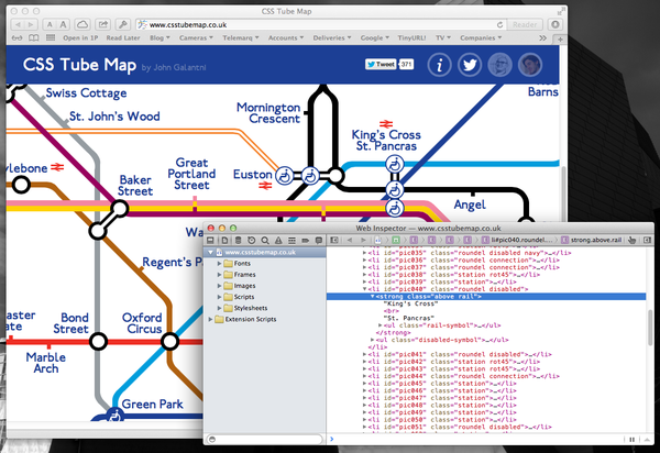
But when it comes to artistic creativity, constraints are often a good thing, which is why some of the best photos are taken with prime lenses rather than zooms. And as CSS itself has become ever-more capable, it has allowed people like John Galatini to create this Tube map entirely from HTML and CSS.
You can tell it's not an image, because you can copy and paste the text.
Just as amazing is Burak Can's CSS-only MacBook Air, where the screen background is the only image used.
On the other hand, people have been doing some cool but much simpler stuff with CSS for many years. I like Román Cortés's Homer Simpson from 5 years ago; click the Animate buttons to see how it's made.


