I've talked before about some of the nice statistics the Financial Times is gathering about the epidemic, and the clear dispassionate way it's presenting them.
Their latest tool gets more interactive, and lets you compare, in various ways, how your country is doing against others. I like three things about this in particular.
Firstly, you can choose a linear scale. Log scales are handy for scientific visualisation but are harder to grasp intuitively.
Secondly, you can get the numbers per capita, which I think is much more useful than absolute figures, though it doesn't of course take into account population density, which is also important.
Thirdly, when you get the analysis in a form you like, you can capture that in the URL and send it to others: the inability to do that is a common problem in today's over-Javascripty pages!
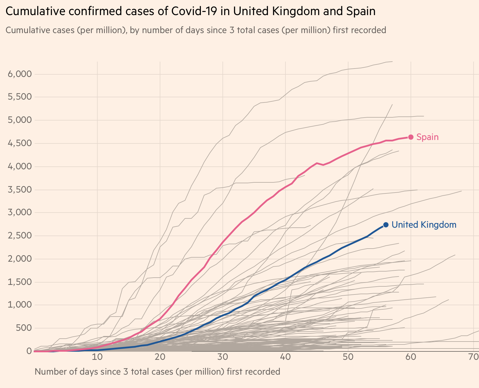
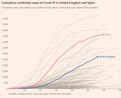
So you can do your own investigation and see that by some measures, your country is doing fairly well (cumulative cases compared to Spain):
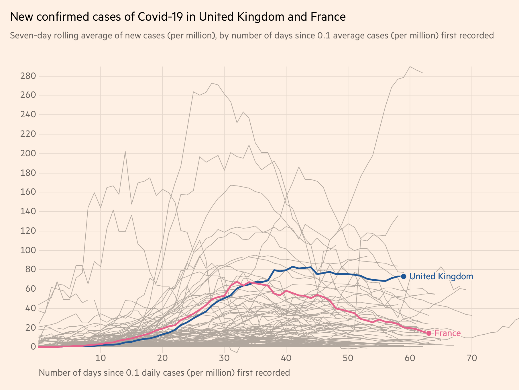
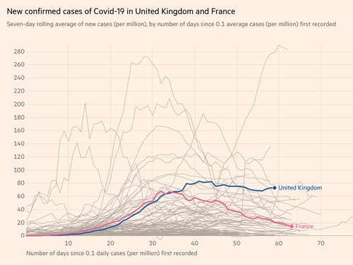
And by other measures not so well (daily new cases compared to France):
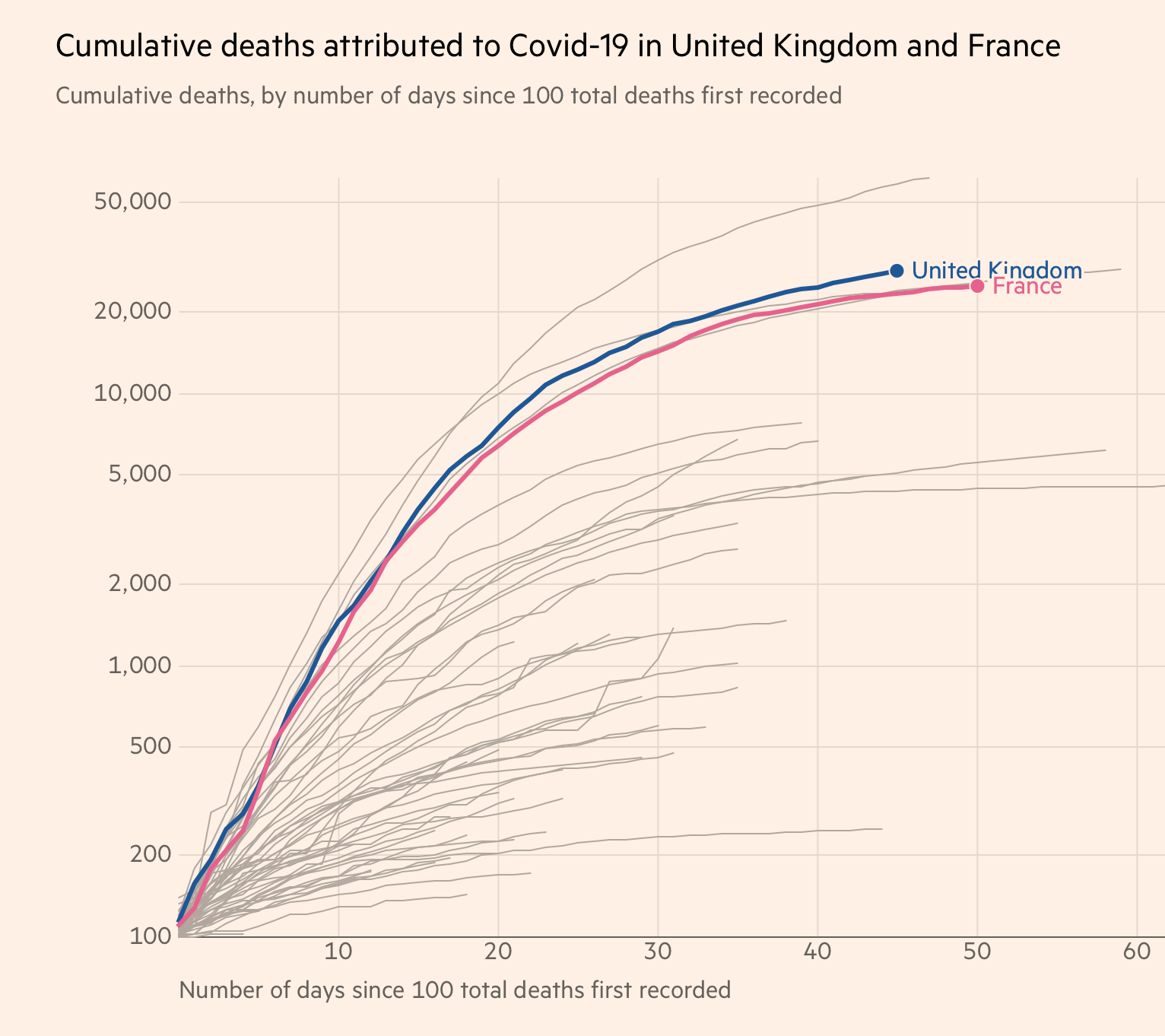
You don't have to switch countries to get different viewpoints, though. Suppose you wanted to make the case that the UK and France were pretty much neck-and-neck, you'd plot the absolute cumulative deaths on a log scale:
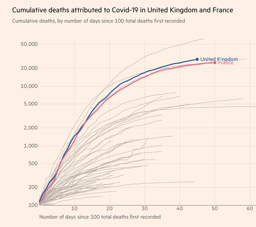
(Neither of these capture the fact that France has less than half the population density of the UK, but they're still useful illustrations.)
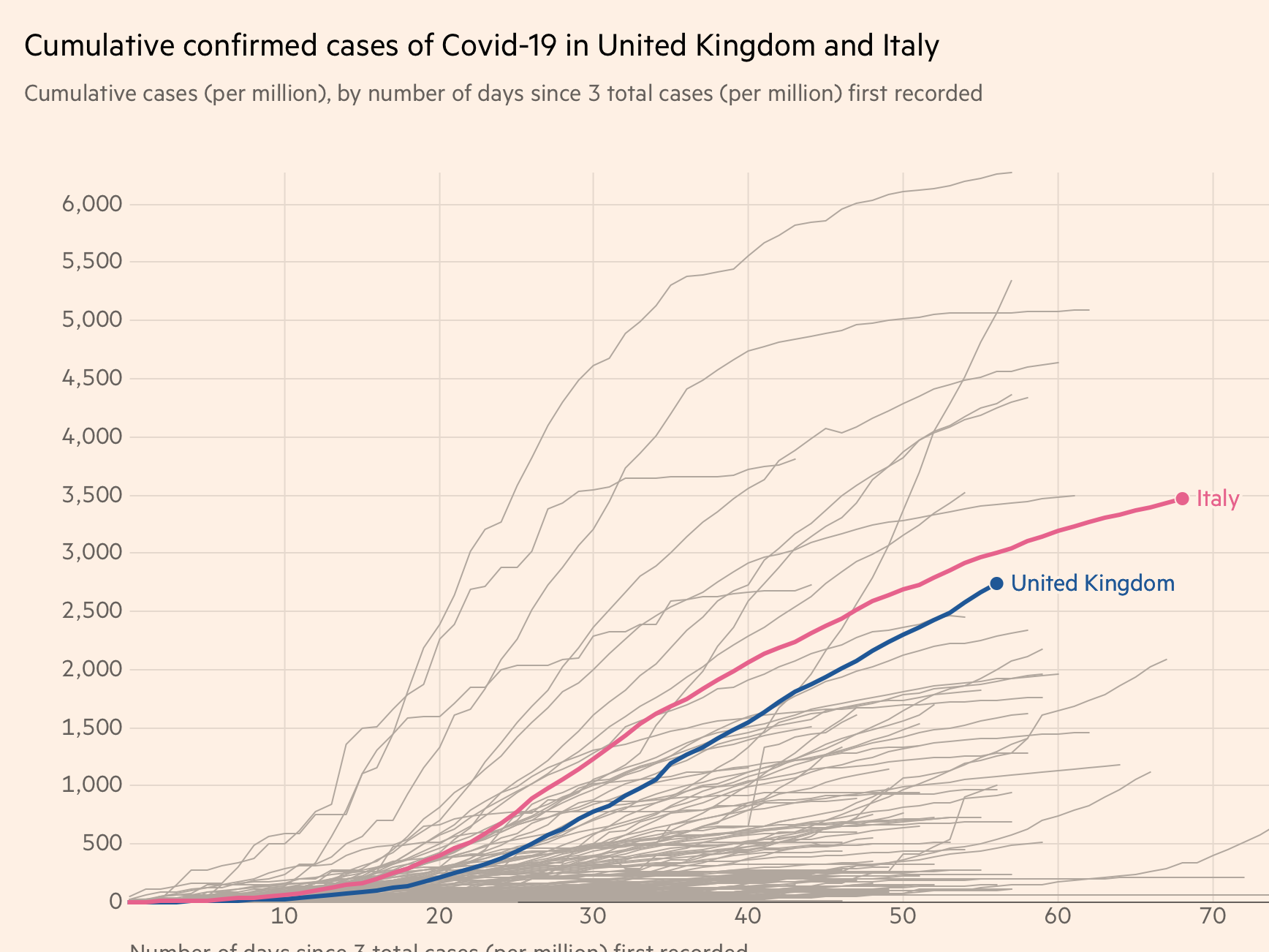
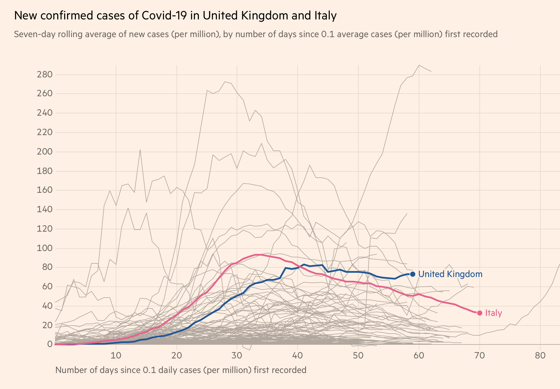
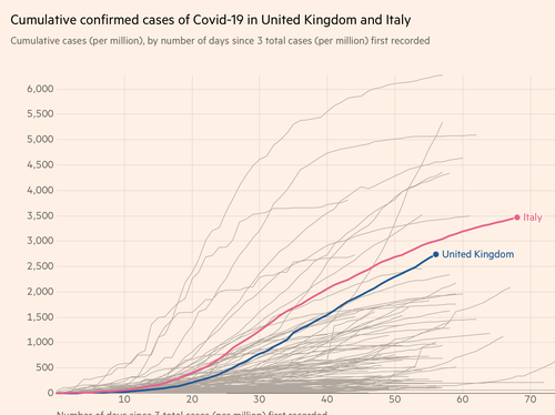
Here's another example:
Let's display the same data about the UK and Italy in two different ways.
Do you want to make the UK (or its government, healthcare system, population, whatever) look reasonably good? Plot the cumulative cases.
Does your editorial policy or personal preference dictate that you want to make the UK government, healthcare system or population look bad? Then plot the same data as a daily rate (roughly the gradient of the above graph).
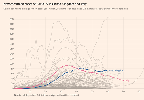
That's the same data over the same period on the same kind of axes.
All of which illustrates why it's good to have a tool where you can explore the data yourself. As long as you really do explore it and don't just stop when you get the conclusion you want!
In the above examples, the images are links to larger versions: the links in the text take to the FT site where you can experiment to your heart's content.