Covid: Destiny and Density?
It always seemed probable to me that Covid infection rates would be closely related to population density. When you walk down the street, how many people do you pass? Are you in a house surrounded by fields or in a tall vertical apartment block where you share an entrance and staircase with many other households? How big are the schools? And so on.
At a country level, though, this is difficult to test. I plotted the very latest total number of Covid-related deaths per million population against the population density per sq. km. for some countries similar to my own (UK), and it didn't show a clear correlation.
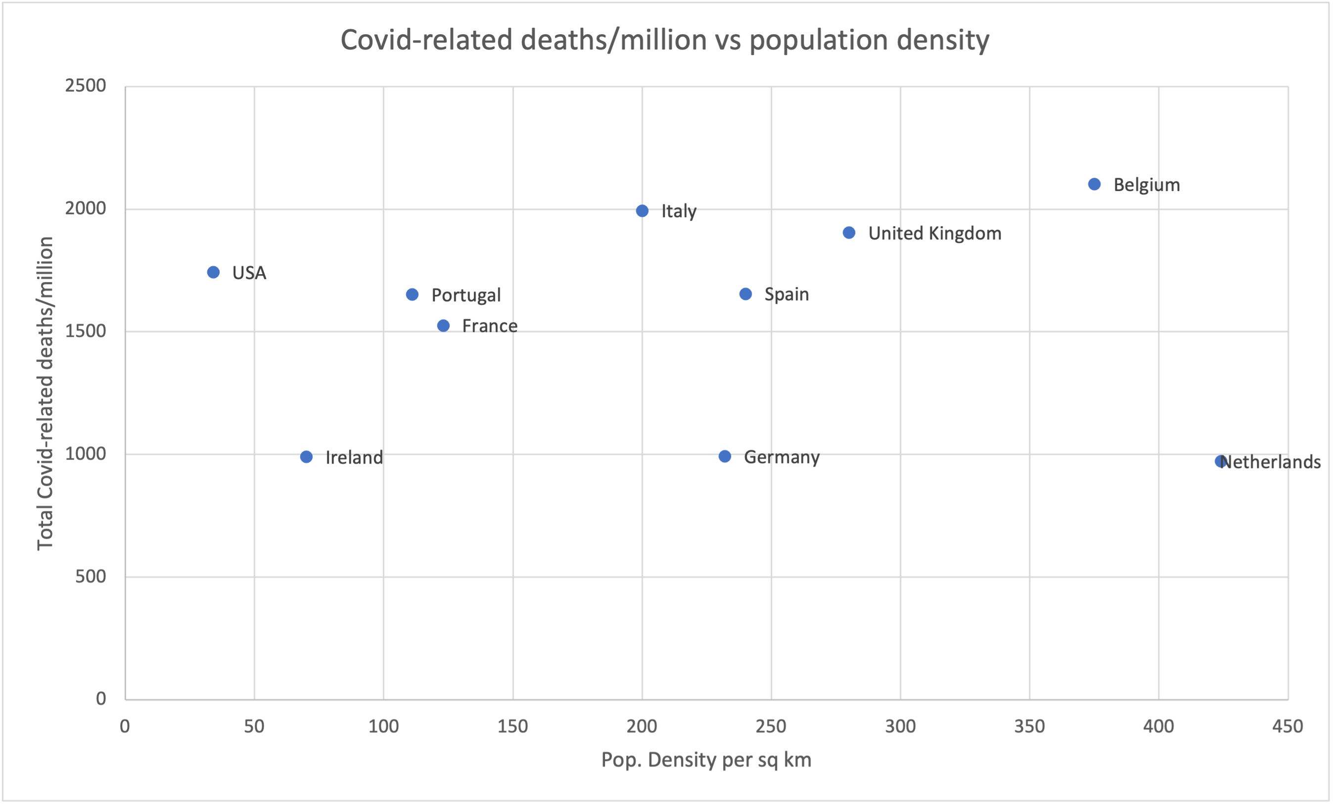
Sources: Statista and Wikipedia.
(As usual, whatever they're doing in the Netherlands is good. Why do the Netherlands keep doing that with everything? Please stop. It's very annoying to the rest of us.)
Depending on your political persuasions, or whether you're a glass-half-full or a glass-half-empty kind of person, you could interpret this in various ways!
My own view (at present), for what it's worth, is that our government and senior civil servants didn't put enough emphasis on lockdowns in the early months, and that cost us a lot. But they did put much more energy and resources than most other countries into securing vaccines on a huge scale, very early, and we're now reaping the benefits. So depending on the time period you examine over the last year, the picture relative to other countries can look very different. (The sadly-missed Hans Rosling would have had some nice animations, no doubt!)
At present, if you take the long view of total Covid deaths per capita, we're a bit higher than the average for similar countries, but our rate of new deaths is lower than almost anyone's, so we will probably look better over time. So it could have been much better, and it also could have been much worse.
Anyway, back to population density. The problem is that density is far from evenly distributed. If I plot England on the map, as distinct from the UK as a whole, it appears in a very different place: the top-right:
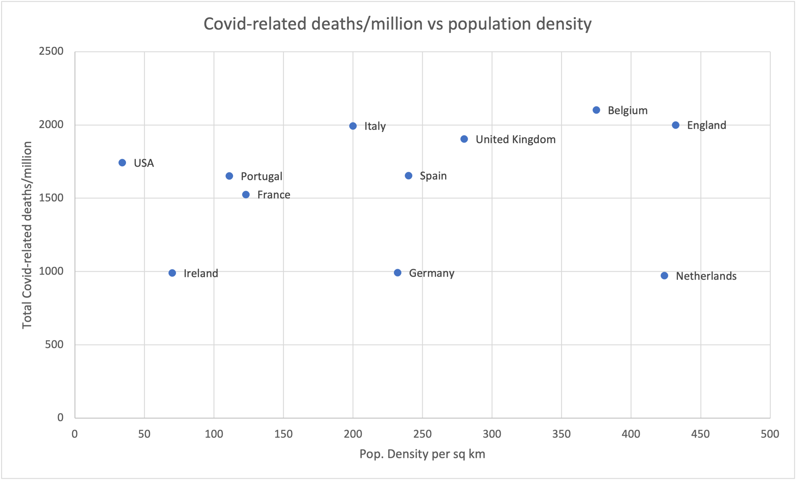
England is up there with the most-afflicted other countries from my list -- Italy and Belgium -- but it does have a notably higher population density than any of them.
Anyway, the results of my quick graphs are that I was probably wrong: it's not clear that population density is a useful metric, at least when done at this scale.
What we really need, if we want to compare the situation in different countries, I think, is statistics about both Covid cases and population density across Europe on a 20km grid. Then we could compare them more usefully, and one day, perhaps, we'll know whether I'm wrong in the details too, or only on the larger scale!
Comments
That's a very good comment, Jim: the whole question of what counts as a Covid-related death is a very vexed one.
Stats are very hard when there are this many variables. I thought at one point it would be interesting to try and compare London and Paris, but it's remarkably tricky to work out what the appropriate boundary is for each city to do a sensible comparison...
Leave a Comment