Tag Archives: covid

When not to Excel

Back in about 1993, I was doing the bookkeeping for a big project being undertaken by my local church. Donations were flooding in, and we needed to keep track of everything, send out receipts, forms and letters of thanks, and note whether each donation was eligible for the UK tax relief known as ‘Gift Aid’.

I was keeping track of this using on a PC running the now long-gone Microsoft Works, which, for those less familiar with last-millennium computing, was a software suite incorporating basic and much cheaper versions of the things you found in Microsoft Office: a word-processor, database, and spreadsheet. If your needs were simple, it worked rather well.

Anyway, at one point I was printing out a list of recent donations on my dot-matrix printer, and I noticed what appeared to be some data corruption. In the midst of the sea of donors’ names, there were a couple of dates being printed out. Was this a software bug, or was my database file corrupt? I started investigating, while wondering just how much data I’d entered since my last backup and whether I could recreate it…

In the end, the answer was simple, and I breathed a huge sigh of relief. I tried recreating the entry for one of donors and the same thing happened again, at which point I dug a bit deeper and discovered a ‘feature’ of the app. The lady’s first name was ‘June’, and, though it displayed just fine on the data-entry screen, behind the scenes, it had been turned into 1/6/93! I skimmed quickly through the congregation to find the other problematic record, and found it was for a donation from a lady named ‘May’!

When I came back to doing some scientific computing in academia a few years ago, I was surprised and slightly worried to see several of my colleagues processing their data with Excel. It’s a wonderful program and very appealing, because of the ease of viewing, checking and plotting graphs of your results, but it comes with lots of problems of its own and shouldn’t be used as a substitute for a proper database (if you’re a church accountant), or for something like Jupyter Notebooks, if you’re a scientific researcher, unless you’re exceedingly careful. Last year, more than a quarter of a century after my issues with May and June, 27 human genes were actually renamed because of the number of errors caused in scientific papers by the use of Excel by researchers. The genes’ previous names were things like ‘SEPT1’.

All of this came to mind when reading Tim Harford’s enjoyable piece in yesterday’s FT, The Tyranny of Spreadsheets. Harford follows the origins of spreadsheets, double-entry bookkeeping and other ways of keeping track of things, up to the famous case last year where 16,000 people weren’t promptly told they had positive Covid test results, because somebody had used Excel’s old XLS file format, which can only store about 64,000 rows of information, instead of the newer XLSX. That’s not really a problem; the problem is that Excel doesn’t give you adequate warning when it’s discarding data, or changing it in an attempt to be helpful. And the results can be serious.

To quote the article:

Two economists, Thiemo Fetzer and Thomas Graeber … decided that no catastrophe should be allowed to occur without trying to learn some lessons. They combed through the evidence from Public Health England’s mishap. And by comparing the experiences of different regions, they concluded that the error had led to 125,000 additional infections.

Fetzer and Graeber have calculated a conservative estimate of the number of people who died, unknown victims of the spreadsheet error. They think the death toll is at least 1,500 people.

Think about that, as you click ‘Save As…’ and pick your data format.

(Thanks to my sister-in-law Lindsey for the link to the Harford article, which also traces some of the origins of spreadsheets from the 14th century; that’s before even I was using them!)

Covid: Destiny and Density?

It always seemed probable to me that Covid infection rates would be closely related to population density. When you walk down the street, how many people do you pass? Are you in a house surrounded by fields or in a tall vertical apartment block where you share an entrance and staircase with many other households? How big are the schools? And so on.

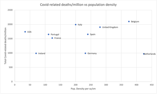
At a country level, though, this is difficult to test. I plotted the very latest total number of Covid-related deaths per million population against the population density per sq. km. for some countries similar to my own (UK), and it didn’t show a clear correlation.

Sources: Statista and Wikipedia.

(As usual, whatever they’re doing in the Netherlands is good. Why do the Netherlands keep doing that with everything? Please stop. It’s very annoying to the rest of us.)

Depending on your political persuasions, or whether you’re a glass-half-full or a glass-half-empty kind of person, you could interpret this in various ways!

My own view (at present), for what it’s worth, is that our government and senior civil servants didn’t put enough emphasis on lockdowns in the early months, and that cost us a lot. But they did put much more energy and resources than most other countries into securing vaccines on a huge scale, very early, and we’re now reaping the benefits. So depending on the time period you examine over the last year, the picture relative to other countries can look very different. (The sadly-missed Hans Rosling would have had some nice animations, no doubt!)

At present, if you take the long view of total Covid deaths per capita, we’re a bit higher than the average for similar countries, but our rate of new deaths is lower than almost anyone’s, so we will probably look better over time. So it could have been much better, and it also could have been much worse.

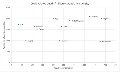
Anyway, back to population density. The problem is that density is far from evenly distributed. If I plot England on the map, as distinct from the UK as a whole, it appears in a very different place: the top-right:

England is up there with the most-afflicted other countries from my list — Italy and Belgium — but it does have a notably higher population density than any of them.

Anyway, the results of my quick graphs are that I was probably wrong: it’s not clear that population density is a useful metric, at least when done at this scale.

What we really need, if we want to compare the situation in different countries, I think, is statistics about both Covid cases and population density across Europe on a 20km grid. Then we could compare them more usefully, and one day, perhaps, we’ll know whether I’m wrong in the details too, or only on the larger scale!

Introducing the Windowizer

Office Meeting 2.0.1

In my post yesterday, I forgot to mention the final twist to my open-air Teams meeting, which made it even more surreal.

Just after pressing the ‘Leave meeting’ button on the app, I walked through our village churchyard and fell into conversation with a gravedigger. No, really. He was filling in a hole, and, leaning on his spade, told me that the heavy clay around here was nothing compared that that around Lavenham. It was a strangely Shakespearian encounter; I half-expected him to bend down, pick up a skull and ask if I recognised it.

After a brief but cheery discussion, I bade him good day and departed, thinking that I should probably have tossed him half a crown for good luck, or something.

Definitely not my typical office meeting, I thought to myself, and Tilly and I walked home debating the whims of Lady Fortune in iambic pentameter.

Office Meeting 2.0

Every Wednesday afternoon during term, we have a departmental meeting for the senior staff, which used to take place in an efficient but not-very-inspiring and rather windowless room in the Lab. There are typically 50-100 attendees, and so, when it moved into the virtual world, we don’t in general use video; most people only turn on their cameras when they’re talking.

Well, this week, a rather wonderful thought occurred to me.

Since this meeting is essentially an audio-only experience, I realised I didn’t need to postpone my dog-walk until after it had finished. Why not do them at the same time? Especially since I was more likely to be in the role of audience than presenter for the duration of this one. Much more efficient.

So I fired up Microsoft Teams on my phone, put it in my jacket breast pocket where I knew the speaker would be clearly audible (since that’s how I normally listen to podcasts and audiobooks), and headed out.

Now, it’s rare for me to say anything good about Teams — actually, it’s rare for anyone to say anything good about Teams, as far as I can see — but on this occasion it performed beautifully, the audio quality was excellent and the video, when people did turn on their cameras, was excellent too, albeit slightly blurred by the raindrops.

At the end of the meeting, as people were saying goodbye, I turned on my camera to reveal that I was in fact wrapped up and squelching through the mud in pursuit of my spaniel, something nobody had been aware of up to that point. And for me, it had been a thoroughly enjoyable meeting. Just imagine what it would be like in sunshine!

Anyway, strongly recommended, if you have the option. Combine your meetings with your daily exercise. Go and watch the rabbits. I promise you it’ll be a more pleasant experience than sitting in your average office meeting room.

And remember, there’s no such thing as bad weather, only inappropriate clothing.

No, sorry, you can’t Zoom in that far

Having been a big fan of Zoom and extolled its virtues in the past, I thought it only fair to share a current criticism. (I’m talking about the videoconferencing app, of course. I’m an even bigger fan of the other Zoom and have relied on their products for years… definitely recommended!)

Anyway, back to video calls. I was playing recently with virtual cameras in OBS so I could do fun things like adding lower-thirds titles to my video stream…

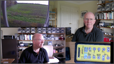
or blending multiple video streams into one….

and my friend Nicholas commented that it was very clever, but any text was not actually that readable. At which point we delved into the Preferences > Statistics menu on the Zoom app and discovered that the video resolution was only 640×360; definitely lower than it used to be.

Now, this is perfectly fine for having a conversation with somebody, so for the vast majority of Zoom use, it’s not an issue. And if you turn on screen-sharing, your screen image is sent at a much higher resolution, so that’s fine too.

But it is an issue for some of my colleagues who like using pointing cameras at whiteboards or documents while giving remote lectures, or even if you’re just trying to hold something up to your camera for the person at the other end to read.

If you search online, you can find various references to ‘Enabling HD’, or to different resolutions being possible for Business or Education accounts, but as far as I can gather, these are all currently disabled or have no effect. I think Zoom may be restricting things to manage the load on their servers, which makes me wonder how much actually goes through their servers? At least for a 2-person call, like the one Nicholas and I were in, it really ought to be peer-to-peer. (Like Skype used to be in the early days before Microsoft bought and ruined it.) Still, to be fair, even the otherwise-abominable Teams does do a much better job at the moment when it comes to resolution.

Well, this may resolve itself in Zoom, but bizarrely, in the meantime, if you care about resolution of your camera more than you care about framerate or latency, the solution is probably to show it on your local display in high resolution, and then share your screen.

© Copyright Quentin Stafford-Fraser