Not-so-smart marketing
In-store signage is often not very well thought out. Long-time readers may remember the seasonal toilet rolls at one of my local stores, and an aisle entirely free of long-life milk at another.
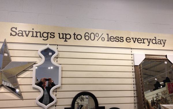
Yesterday we spotted this in HomeSense in Cambridge:
The bizarre messages continue elsewhere in the store. Above one checkout was a sign with an arrow saying "Pay up to 60% less here." Less than what? Less than the ticketed price? Less than at any other checkout in the store? Do these people have any grasp of how meaningless these signs are? Or -- more worryingly -- do signs as meaningless as this actually work on the general populace?
Now, they may be cleverer than they look. My nephew Matt points out that they might be trying to encourage people to buy today because the savings will be lower tomorrow. This does make some sense, because it's the kind of store that, though it looks mildly interesting from the outside, I think few people would voluntarily enter twice.


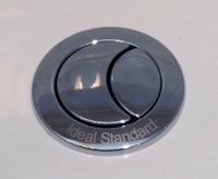
 Here at Status-Q headquarters, we're having a new bathroom fitted, which means we're getting all these newfangled gadgets that you youngsters just take for granted. Things like mixer taps, which our international friends are amused that we didn't adopt about 50 years ago. I tell them that British plumbing is like the weather: it's unpredictable, and we like it that way, because it gives us something to make polite conversation about when inspiration is otherwise lacking.


