Wet Feet

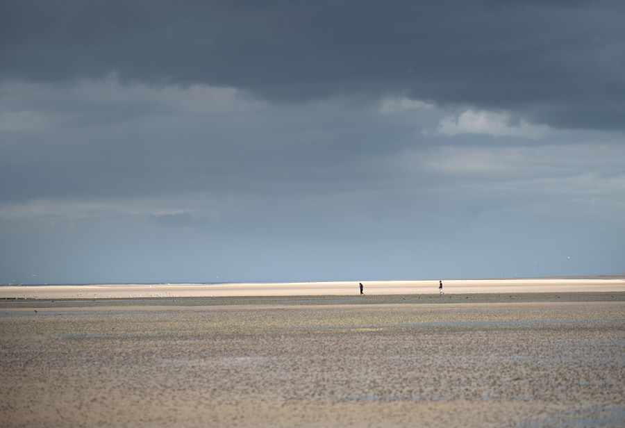
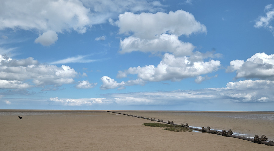
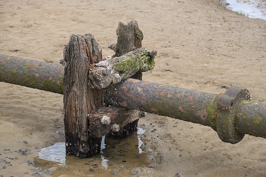
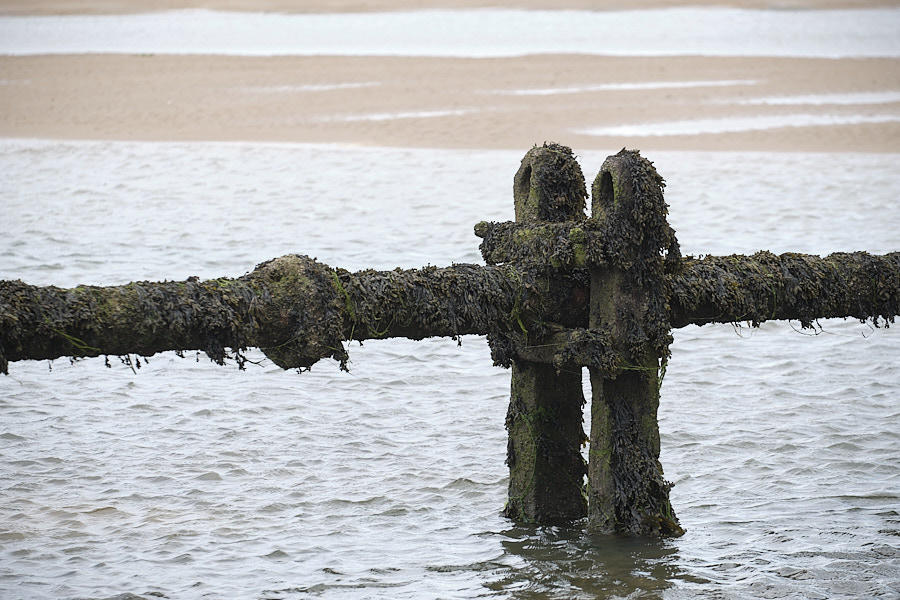
Ardroil Beach

Ardroil Sands, Uig, Isle of Lewis, on New Year’s Eve.

This beach is generally thought to be the location where, in 1831, the Lewis Chessmen were found.

And yes, I did get my feet wet. And yes, it was worth it.

Update: My mother says this must be the best-selling sequel to ‘A Bridge Too Far’…

Persistent Visitor

We have a friend who keeps coming to visit, despite the lockdown…

He does maintain appropriate social distancing while here, though.

Helps himself to food…

Always politely interested in the conversation.

“What’s the time, Mr Wolf?”

Generally a very pleasant companion.

Concerning Hobbits…

You can learn a lot from the wisdom of Hobbits.

I’ve discovered, for example, that it’s important not to neglect Second Breakfast, because to do so can lead to increased snacking between meals.

68 snacks of wisdom

Kevin Kelly, on his 68th birthday, offers 68 Bits of Unsolicited Advice. And they’re good. Or amusing. Or both.

You don’t need to read the whole thing. Just scroll to a random point and read something. Then repeat for the next 67 days 🙂

More good analysis tools from the FT

I’ve talked before about some of the nice statistics the Financial Times is gathering about the epidemic, and the clear dispassionate way it’s presenting them.

Their latest tool gets more interactive, and lets you compare, in various ways, how your country is doing against others. I like three things about this in particular.

  • Firstly, you can choose a linear scale. Log scales are handy for scientific visualisation but are harder to grasp intuitively.

  • Secondly, you can get the numbers per capita, which I think is much more useful than absolute figures, though it doesn’t of course take into account population density, which is also important.

  • Thirdly, when you get the analysis in a form you like, you can capture that in the URL and send it to others: the inability to do that is a common problem in today’s over-Javascripty pages!

So you can do your own investigation and see that by some measures, your country is doing fairly well (cumulative cases compared to Spain):

And by other measures not so well (daily new cases compared to France):

You don’t have to switch countries to get different viewpoints, though. Suppose you wanted to make the case that the UK and France were pretty much neck-and-neck, you’d plot the absolute cumulative deaths on a log scale:

(Neither of these capture the fact that France has less than half the population density of the UK, but they’re still useful illustrations.)


Here’s another example:

Let’s display the same data about the UK and Italy in two different ways.

Do you want to make the UK (or its government, healthcare system, population, whatever) look reasonably good? Plot the cumulative cases.

Does your editorial policy or personal preference dictate that you want to make the UK government, healthcare system or population look bad? Then plot the same data as a daily rate (roughly the gradient of the above graph).

That’s the same data over the same period on the same kind of axes.

All of which illustrates why it’s good to have a tool where you can explore the data yourself. As long as you really do explore it and don’t just stop when you get the conclusion you want!

In the above examples, the images are links to larger versions: the links in the text take to the FT site where you can experiment to your heart’s content.

Documentary evidence

Today I was applying, on behalf of my department at the University of Cambridge, for an educational discount on some software.

The form on the website asked various questions, and included an obligatory upload section: “Please provide documentation supporting your institution’s accreditation status”.

So I sent them this:

It is, apparently — for I must confess I didn’t read it carefully — “a charter in the form of letters patent of inspeximus and confirmation by Edward I to the Chancellor and Masters of the University of Cambridge confirming the privileges of the University granted by Henry III, and an agreement between the Scholars and Burgesses for the punishment of disturbers of the peace by a representative group from both sides”. It dates from 6 Feb 1291, and it’s worth looking at it on the University Library’s web site, where you can zoom right in and see the lovely illustration in the top-left corner.

Anyway, the company granted us the academic discount. Probably wise. You wouldn’t want to upset Edward I. Remember what he did to the Scots.

Why do you have a ‘Knowledge Base’ on your website?

Question 1. Which of the following are indicated by having a ‘Knowledge Base’ on your company’s ‘support’ pages?

  • (a) A lack of the discipline needed to write proper documentation.

  • (b) Insufficient staff to provide proper support.

  • (c) Inadequate engineers to provide a reliable product.

  • (d) A poor user-interface experience in your product.

  • (e) All of the above.


The best thing about creating a website in blog format, I’ve always thought, is that you don’t need to maintain it to nearly the same degree as you would most other sites. Why? Because everything has a date, and that date is paramount; it is clearly marked. This makes it obvious to the reader that a post was written in a particular context, and, while the content may still be useful some years later, you can’t blame the author for not being able to predict the future if it’s no longer accurate or relevant now! As an author, therefore, you don’t need to be constantly re-reading, deleting, updating, clarifying, as you would with most other forms of documentation.

The appeal of the so-called ‘Knowledge Base’ — a searchable database of support articles on a company website — is that it also promises an alternative solution to this challenge of maintaining structured documentation, but instead of using old Father Time to winnow out inaccurate material, it uses a search engine to help you ignore it.

If you force your customers to type things into the Knowledge Base search box before you let them get anywhere near the page with your phone numbers or email addresses, there’s even a chance they may find out the answer to their question and not bother you! Bliss!

What’s the problem?

Search engines are wonderful things, of course, and this isn’t a bad idea in theory, but if your experience is anything like mine, these knowledge bases are chiefly a source of frustration for customers.

Why is this?

  1. Users don’t know what to search for. They may not know the phrases you use internally to categorise certain issues. A human support person would know that when you said you had an issue with your mouse, you might be referring to a problem labelled ‘trackpad’ or ‘cursor’ in the docs.

  2. The articles aren’t well-indexed. Do you, for example, make sure that the error message the user actually sees appears in plain text in the articles, so the search engine has a chance of finding it? Do your articles have extensive tagging with relevant keywords which may not be in the text? If the error is slightly different because they used a different filename, will it still be found?

  3. The search engines aren’t good enough. We’ve been spoiled by Google. Does your search engine understand synonyms? Does it rank pages well? Does it show a good summary so your users don’t have to read all 26 articles returned by their query?

  4. The content is outdated. If the user actually succeeds in finding a relevant article, is it clear that it only refers to version 4.2 of the product running on Android, and not version 5.0 running on iOS, because the latter didn’t exist at the time it was written? Will they know that the solution it proposes can’t possibly work for them? Because this advice is buried in a database, it may be harder for your support staff to know this is a problem.

How to fix it!

I have four pieces of advice for anyone who has, or is considering implementing, a Knowledge Base on their website:

  1. Make sure the full text of your knowledge base is searchable by Google. They will do a better job than you do.

  2. Allocate more, not less, in the way of resources, if you want your documentation in this form. Knowledge Bases are not like blogs. You can’t dump things in there and forget them. Articles need to be reviewed, re-written, re-indexed, re-keyworded and regularly purged if the contents are to remain useful. You need to do this in addition to writing the actually text itself. Customers will not thank you for anything which suggests you believe that their time is much less important than yours. If they have to search through dozens of articles to try and find an answer, it probably indicates you aren’t doing your job. There may be good reasons for using this format for your documentation. Cheapness isn’t one of them.

  3. If you insist on putting your users through this and they still contact you, you should provide better support once they do. For heaven’s sake, don’t just connect them to somebody in a remote location who only has access to the same information! Don’t offer a chat link to somebody who is ‘Very sorry to hear about your problem’ but knows less about it than they do. Connect them to the engineers who produced the flawed product, or the writers who produced the inadequate documentation.

  4. This is the key one: The bigger your Knowledge Base, the worse job you are doing. In most situations, an entry in your Knowledge Base indicates a failure in communication elsewhere. Insufficient documentation, unhelpful errors, unreliable products. Your users won’t generally be consulting a Knowledge Base if everything is going well for them. Treat it as an issue-ticketing system, and reward those whose work means that articles can be removed from it. And make sure you have the processes in place that this actually happens!

In the beginning…

My family are a constant source of useful information. My nephew James tells me he’s just discovered that it’s ‘World Design Day’. (He’s a designer and nobody had mentioned it to him before now. Shocking, eh?)

Anyway, this is another nice episode in what is rapidly becoming a theme on Status-Q. We started with The International Year of Planet Earth, then moved on to the discovery of Earth Day, but World Design Day surely has to be the most ambitious. I mean, where do you start?

Well, I guess you might begin with ‘Let there be light…’?

The Liar Tweets Tonight

This is just brilliant…

The Biggest Event You’ve Never Heard Of?

In a slightly-related follow-up to my recent repost from the archives…

Yesterday, apparently, was ‘Earth Day’. I missed this fact — you may have done so too — but, unlike my brother, I had actually heard of it before, so I knew it wasn’t a marketing ploy by vendors of topsoil and compost. But I thought it was some one-off hippy jamboree back in the 90s.

However, it turns out to be a regular and international thing, which has been going on about as long as we have! He only found out about it because it was included in his Apple Calendar. He went and Googled it, and sent me a link.

Gosh, the ways we find out about things these days, eh? Other people put them in your calendar, and you have to go and look them up to find out what they are. Whatever next?

Anyway happy (belated) Earth Day, everybody! You’ll know for next year…

Daddy, what did you do in TIYOIY?

Sometimes, I find, it’s worth looking back into my blog archives to ponder how the great events of the past have affected the world since.

Do you remember, for example, when we declared 2009 to be TIYOIY?

A remote dawn

Around Christmas and New Year, I was in Scotland in my campervan. I took lots of video footage. Far too much, in fact, so I’ve been gradually working my way through it, on and off, for several months. This evening, I came across this rather pleasing scene. It’s just a still frame captured from video, and on a GoPro too, so the quality’s not great, but I hope you enjoy the view!

This is a dawn dog-walk at Uig on the Isle of Lewis, on New Year’s Eve. Not only was I up at dawn, I had already breakfasted and was setting off for a hike! However, this sounds a bit less impressive when I point out that sunrise in mid-winter up there is after 9am.

The small black blur on the right-hand side, which you may be able to see if you click for a larger version, is Tilly romping in the heather.

© Copyright Quentin Stafford-Fraser