Monthly Archives: May, 2020

One man and his vlog

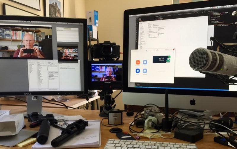
Yesterday I realised I was looking particularly suave and debonair, so decided it would be the right time to point a camera at myself. Mmm…

If you want to try using a decent digital camera for videoconferencing, you normally either need:

  • something which will capture an HDMI output signal from your camera and feed it into your computer over USB, like the Elgato Cam Link,

  • or you need some software which can capture the live preview output and make it available to your operating system as if it were a locally-connected camera. On the Mac, I do this with a combination of Camera Live – which makes it avaliable as a ‘Syphon’ server – and CamTwist, which can take a variety of inputs, including Syphon, and blend them into a ‘virtual camera’ output. There are various tutorials online on how to do this. OBS is a similar popular app, but doesn’t yet support virtual camera output on the Mac.

  • Finally, for some versions of some Mac apps, you may need to remove the app’s signature (which identifies it with a certain set of permissions), to enable it to see virtual cameras as well as physical ones. At the time of writing, Zoom needs:

$ codesign --remove-signature /Applications/zoom.us.app/

P.S. Sadly, various other people have used the phrase ‘One man and his vlog’, so I can’t pinch it on any kind of long-term basis 🙂

Watching the map

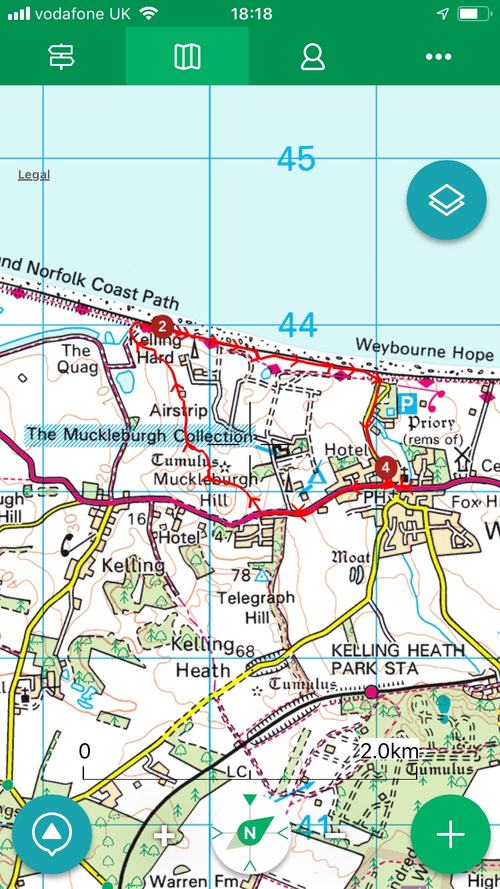
A screenshot from the appI’ve long been a fan of the ViewRanger app for handling maps on my phone. I know I’ve been using it for at least 8 years, because I have tracks recorded from early 2012.

With it, you can use free maps, and buy commercial ones from a range of sources, in many countries, and pay for them in a variety of ways: subscriptions, individual purchases, or — the method I use because I started before the days of in-app purchases — buying a block of credits up front and using them as needed to purchase the map tiles you’re interested in. ViewRanger isn’t perfect: I find bits of its user interface very counter-intuitive, but in general it’s served me very well.

Another worthy contender for UK users, by the way, is the app UK Map, written by a good friend of mine, and which I’ve been using even longer than ViewRanger. UK Map has always provided a great combination for users here: a standard basic UK road atlas, always available offline; the ability to download the free Ordnance Survey maps (since almost the moment they became available), and the overlaying of paths from OpenStreetMap, which are often the most up to date indications of where you can actually walk. More recently, it too gained the option to buy premium maps, but by then I was somewhat invested in the ViewRanger ecosystem. Nonetheless, I do recommend UK Map – it’s helped me out on more than one occasion when I found myself completely out of phone coverage and just needed a good old-fashioned street atlas, for example. Don’t be fooled by its lack of flashy graphics and fewer immediately-obvious features. Phil, the author, is a very smart guy and knows what he’s doing. It’s worth having on your phone.

Maps have always held a fascination for me, and their combination with technology especially so. I remember I was in Seattle on the day the iPad was released, and so was able to get one that day, about 6 weeks before most of my European contemporaries. (I’m still a bit smug about that!) It only took me a few hours, though, to realise it was the best map-viewer I had ever seen. A zoomable, infinitely-scrollable, tactile display that was also big enough to show a reasonable area? Amazing. (The main thing I miss, by the way, about no longer also having an iPad Mini is that it combined most of that with the ability to fit in a coat pocket.)

Anyway, this is all old hat now. We almost all wander the footpaths and byways gazing at our phones, rather than unfolding bits of paper from our map pockets. They do, after all, have that undeniably useful extra feature – the little blinking dot or crosshairs showing where you actually are. And zooming and scrolling mean that the place you’re heading for is no longer on the other side of the fold! I do find, though, that zoomability means I’ve lost the intuition I used to have about how long it would take me to walk a certain number of inches…

There’s another problem, too, with phone-based navigation, that I’ve found in the soggier parts of the UK: touchscreens, and indeed fingerprint readers, really don’t work very well in the rain. The process of extracting the phone from a damp pocket, trying to find something less damp to wipe it on, failing to unlock it with my fingerprint and having to type a PIN before trying to manipulate a semi-responsive touchscreen has just occasionally left me thinking that even damp paper would be preferable to electronics.

Until today.

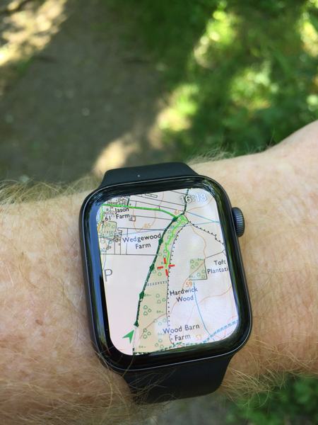
Because today I discovered something I should have noticed some time ago. ViewRanger has an interface for the Apple Watch. If it’s running on my phone, I can simply raise my wrist to see where I am.

I could have used this in the past, had I discovered it, but it’s also vastly improved by my recent purchase of a Series 4 watch to replace my Series 0, which means that when I raise my arm to look at my watch, things actually appear before my arm gets too tired and has to be lowered again. In fact, while testing it on this afternoon’s dog walk, it was effectively instantaneous. Where does this footpath to the right go? Let me just glance at my wrist – ah, OK. You can scroll around, zoom in and out etc, but most of the time, all I needed was a quick glance: no unlocking, no soggy touchscreen. (It also looks amazing, but I think that’s mostly because of another recent purchase: a new and expensive pair of spectacles!)

All of which makes me wonder whether, despite being at the opposite extreme in terms of screen size, I may after a decade have found an even better map viewer, at least in certain circumstances, than the iPad!

A rare East Anglian lakeside walk

In the flat, low-lying eastern part of England, where we live, much of the land is only just above sea level, and for many centuries the inhabitants have been working hard to avoid the appearance of large areas of water.

We have rivers, of course, and dykes and canals, and they are all kept carefully in order and they generally behave and do as they are told. There are village ponds, too.

But to see a body of water of any size here is a rarity, which is why I occasionally make the pilgrimage to Fen Drayton Lakes, about 12 miles from my house. Until around 30 years ago, it was a gravel quarry, but that’s been enough time for nature to re-adopt it and flourish around it. Yesterday was the hottest day of the year so far, and it was pleasant to walk in the shade along the tree-lined paths and catch occasional glimpses of expanses of cool liquid.

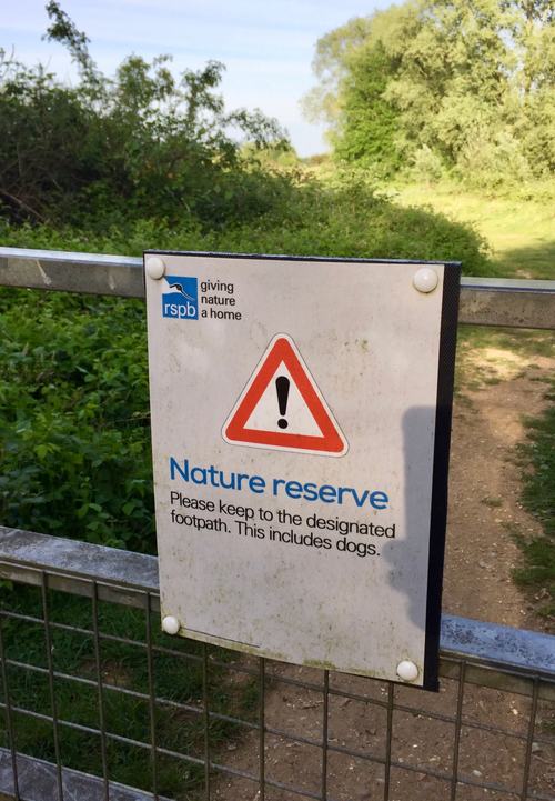
It’s tantalizing, too, because you can’t go in or on the water: it’s an RSPB reserve, and home to a vast number of birds, who were clearly having a good time. I foolishly only had an elderly iPhone with me, so just took a couple of more general snaps of the scenery.

There are certain areas where you do need to make sure your dog pays attention to the signs.

But it’s a lovely spot, and very different from Cambridge just down the road. There’s even a quick and efficient guided-bus service from the city — when we get buses back — for those without other means of transport.

Despite all this, surprisingly few people in the area seem to know about it. Don’t tell too many of them…

Passing the buck the right distance

Here’s something I don’t quite understand. It’s the responsibility of the National Health Service to provide a health service to the nation. Presumably, things like the sourcing of PPE, the purchasing of ventilators, the arranging of tests, and even, to some degree, the deployment of diagnostic phone apps, is their area of expertise. It’s what they do.

Now, these are not normal times, of course, and there’s always the complaint about insufficient funding, past and present. But I doubt that’s valid now since, presumably, the government would now happily write bigger cheques for the provision of these things. So I’m slightly intrigued that the NHS is complaining that the government isn’t providing them, rather than the other way around! Intrigued, though not surprised.

Now, clearly I’m missing something, because everybody else seems to think the government is responsible for medical supplies too. It could be that PPE supplies are primarily delayed because of something like customs and excise rules, in which case, yes, clearly the government is culpable.

Or it could be that the NHS is saying, in effect, “you underfunded us for years, so now that we have a big problem, it’s actually your problem! So there!” Government departments are presumed to be more competent at logistics than the NHS, when both are given sufficient funding, so we’d better hand it over to you, even though we’re the ones with the contacts and the contracts.

But I think it’s probably that the boundary between the government and public services is a sufficiently blurred one that, if you are senior enough in the NHS, your job title begins with ‘Minister’ or ‘Secretary of State’. This is very convenient, because it means that anyone who wants to complain about how things are going — to increase the ad sales in their newspaper, for example — can make it a political complaint, which is acceptable and even popular, rather than be seen in any way to be criticising the NHS, which would be suicidal.

So that raises the interesting question of where the boundary of blame can sensibly be drawn, while maintaining political correctness. Everyone is allowed to blame the Prime Minister and nobody is allowed to blame a nurse; so where does, and where should, the buck stop between the two?

To the extent that some people believe the UK Covid response has been badly handled, how do we hold the correct public institutions, or individuals, accountable when it comes to be reviewed? When the next health crisis comes along, should we expect the health service to handle the provision of health-related services, or the political party currently in power at that time?

I don’t know anything about the management hierarchy involved, but I’m guessing that, as you ascend it, you reach a point where the payslips no longer have an NHS logo on them; where NHS administrators become civil servants. A bit higher, civil servants become short-term political appointees. Are either of these the correct point for rational people to start assigning blame in the case of unforeseen medical emergencies? Should it be higher or lower?

Looking backwards at the future

Searching recently for emails from one of my academic colleagues, I came across one or two that appeared to have the address written backwards. He works in the Computer Lab at Cambridge, and the email was from user@uk.ac.cam.cl. What was going on?

Well, the simple answer was that my mail archives stretch back quite a long way. I have emails I received from my friend Peter just last week, but I also have some from him that arrived in the early 1990s, and this was just about the time that the UK’s academic networks were switching from the Name Resolution Scheme (NRS) they had used up to that point, over to the Domain Name System (DNS) which was becoming the standard in other parts of the world. NRS addresses started at the more general, and worked down to the more specific. Hence uk.ac.cam.cl.

Actually, email addresses in general tended to look like USER@UK.AC.CAM.CL because on mainframes EVERYTHING TENDED TO BE IN CAPITALS. But Peter was fortunate enough to be an early user of Xerox and Unix-based systems, which were more lower-casey; more cuddly California, less corporate IBM. By the start of the 90s, I too had an email address that looked like quentin.stafford-fraser@uk.ac.cam.cl.

Anyway, the fact that I still have emails from 30 years ago made me reflect, once again, on how extraordinarily successful email has been, not just as a communication medium, but as a storage format.

When I think back on other electronic documents of the time, few, if any could be read now. The companies behind my early ‘desktop publishing’ programs are no longer in existence. Microsoft Word long ago lost the the ability to open documents it had created in the past. And I imagine my documents from WordStar, WordPerfect, Microsoft Works and others would be just as challenging, if I could even find them.

But my email messages I can find. And I can read them. This is despite the fact that they have been through dozens of different email systems, created by a wide range of apps on multiple operating systems, stored on servers around the world and hard disks in my various homes and offices, and accessed through a range of different protocols (IMAP, for most of that period). Not only is my email readable, but it’s easily searchable from multiple locations using a choice of apps on any of my devices. It’s tagged with helpful metadata about authorship, time of creation and receipt, etc. I can choose to store it myself or pay others to do so. And so on. Almost no other digital storage system has proved as powerful and flexible as IMAP-accessed email.

Much of this comes, of course, from the fact that email is governed by open standards, accessed through open protocols, and often stored in non-proprietary formats. Because it is fundamentally about inter-operation, email providers have had no choice. It bugs me that I don’t have my pre-1991 emails, but that was probably because of an inadvertent slip on my part, or a hard disk crash, or something, rather than because of a fundamental limitation of the technology. If I do ever find them on some backup, I’m confident I’ll be able to include them in my archive.

This explains why, like some of my colleagues, I’ve resisted my University’s recent attempts to migrate our email accounts from our existing Open-Source-based system to Microsoft Exchange Online. It’s not because I dislike Exchange per se; after a rocky first decade or two it seems to be settling down quite nicely. But I don’t want to use a Microsoft email reader on all my devices — my own are much better, thank you — and Exchange has repeatedly shown an inability to support IMAP reliably. The messages are also not stored anywhere on a server where I could extract them by any other means in a standard format when I want to move them elsewhere. And I will want to move them elsewhere at some point; history shows me that. Fortunately, I have that power. If my email shows any danger of being locked into proprietary formats, I can simply arrange for it to be forwarded to my own servers and handle it however I like there; that’s what I’ll do if the University turns off the old system completely. And since almost everything does support IMAP, I can move emails around the world to my preferred location with a simple drag and drop.

One of my colleagues said in a recent meeting that his children don’t know what the fuss is about. Email is just something they glance at once a week to see if they’ve had any. As long as it works, they don’t mind where it comes from. Well, they may be right; perhaps it will be less important in future. But this may also be a natural tendency of the young just to focus on the immediate here and now, and the immediate future.

To me, and occasionally to other people, my email archive has turned out to be important. Something I wrote 20 years ago becomes relevant to a patent case now and earns me money because I can look back at the records. Interviewers ask me about the technologies used in a particular project and I can search back to find the answers. I forget the name of a good B&B or hotel in a particular city; email allows me to find it again. I generally had no idea, at the time, that these communications might prove to be important. But they’re a key part of the history of my life.

So here’s my question: If the things you’re doing today turn out to be important a few decades from now, what sort of digital archive would they need to be in for you to find and make use of them then? Best to start using that today, before it’s too late.

Thought for the day

If, like most of mankind, you have passionate convictions on many such matters, there are ways in which you can make yourself aware of your own bias. If an opinion contrary to your own makes you angry, that is a sign that you are subconsciously aware of having no good reason for thinking as you do. If some one maintains that two and two are five, or that Iceland is on the equator, you feel pity rather than anger, unless you know so little of arithmetic or geography that his opinion shakes your own contrary conviction. The most savage controversies are those about matters as to which there is no good evidence either way. Persecution is used in theology, not in arithmetic, because in arithmetic there is knowledge, but in theology there is only opinion. So whenever you find yourself getting angry about a difference of opinion, be on your guard; you will probably find, on examination, that your belief is going beyond what the evidence warrants.

Bertrand Russell

Wet Feet

Ardroil Beach

Ardroil Sands, Uig, Isle of Lewis, on New Year’s Eve.

This beach is generally thought to be the location where, in 1831, the Lewis Chessmen were found.

And yes, I did get my feet wet. And yes, it was worth it.

Update: My mother says this must be the best-selling sequel to ‘A Bridge Too Far’…

Persistent Visitor

We have a friend who keeps coming to visit, despite the lockdown…

He does maintain appropriate social distancing while here, though.

Helps himself to food…

Always politely interested in the conversation.

“What’s the time, Mr Wolf?”

Generally a very pleasant companion.

Concerning Hobbits…

You can learn a lot from the wisdom of Hobbits.

I’ve discovered, for example, that it’s important not to neglect Second Breakfast, because to do so can lead to increased snacking between meals.

68 snacks of wisdom

Kevin Kelly, on his 68th birthday, offers 68 Bits of Unsolicited Advice. And they’re good. Or amusing. Or both.

You don’t need to read the whole thing. Just scroll to a random point and read something. Then repeat for the next 67 days 🙂

More good analysis tools from the FT

I’ve talked before about some of the nice statistics the Financial Times is gathering about the epidemic, and the clear dispassionate way it’s presenting them.

Their latest tool gets more interactive, and lets you compare, in various ways, how your country is doing against others. I like three things about this in particular.

  • Firstly, you can choose a linear scale. Log scales are handy for scientific visualisation but are harder to grasp intuitively.

  • Secondly, you can get the numbers per capita, which I think is much more useful than absolute figures, though it doesn’t of course take into account population density, which is also important.

  • Thirdly, when you get the analysis in a form you like, you can capture that in the URL and send it to others: the inability to do that is a common problem in today’s over-Javascripty pages!

So you can do your own investigation and see that by some measures, your country is doing fairly well (cumulative cases compared to Spain):

And by other measures not so well (daily new cases compared to France):

You don’t have to switch countries to get different viewpoints, though. Suppose you wanted to make the case that the UK and France were pretty much neck-and-neck, you’d plot the absolute cumulative deaths on a log scale:

(Neither of these capture the fact that France has less than half the population density of the UK, but they’re still useful illustrations.)


Here’s another example:

Let’s display the same data about the UK and Italy in two different ways.

Do you want to make the UK (or its government, healthcare system, population, whatever) look reasonably good? Plot the cumulative cases.

Does your editorial policy or personal preference dictate that you want to make the UK government, healthcare system or population look bad? Then plot the same data as a daily rate (roughly the gradient of the above graph).

That’s the same data over the same period on the same kind of axes.

All of which illustrates why it’s good to have a tool where you can explore the data yourself. As long as you really do explore it and don’t just stop when you get the conclusion you want!

In the above examples, the images are links to larger versions: the links in the text take to the FT site where you can experiment to your heart’s content.

Documentary evidence

Today I was applying, on behalf of my department at the University of Cambridge, for an educational discount on some software.

The form on the website asked various questions, and included an obligatory upload section: “Please provide documentation supporting your institution’s accreditation status”.

So I sent them this:

It is, apparently — for I must confess I didn’t read it carefully — “a charter in the form of letters patent of inspeximus and confirmation by Edward I to the Chancellor and Masters of the University of Cambridge confirming the privileges of the University granted by Henry III, and an agreement between the Scholars and Burgesses for the punishment of disturbers of the peace by a representative group from both sides”. It dates from 6 Feb 1291, and it’s worth looking at it on the University Library’s web site, where you can zoom right in and see the lovely illustration in the top-left corner.

Anyway, the company granted us the academic discount. Probably wise. You wouldn’t want to upset Edward I. Remember what he did to the Scots.

© Copyright Quentin Stafford-Fraser