Category Archives: Apple

The watchword

Like many other people, I’ve been eagerly awaiting the arrival of the Apple Watch. It hasn’t really arrived yet, you understand, but you can at least now see it, play with it, and plonk down large amounts of money for it, in anticipation of delivery in a month or two’s time. I spent quite a lot of time experimenting with it at the Apple store yesterday.

I must admit to being something of a watch techno-enthusiast. Back in about 1976, my brother and I were the first kids in my school to have a digital watch, and they, too, were made by a computer company, Commodore.
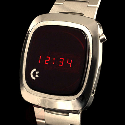
commodore_cbm_time

The company went on to create computers like the Commodore PET and the 64, but, unlike Apple, it made a watch before it did computers. Still, amusingly, it probably looked more like an Apple watch than any timepiece I’ve owned since, because the display used too much power to keep it constantly illuminated; the LEDs only lit up when you pressed the button. I still remember the excitement of staying awake outrageously beyond my bedtime, just so I could see the display change from 23:59 to 0:00. We bought our first digital watches on a discount offer. I think they were £13 each.

Roll forward about a third of a century, and I was an early backer of the Pebble project on Kickstarter.
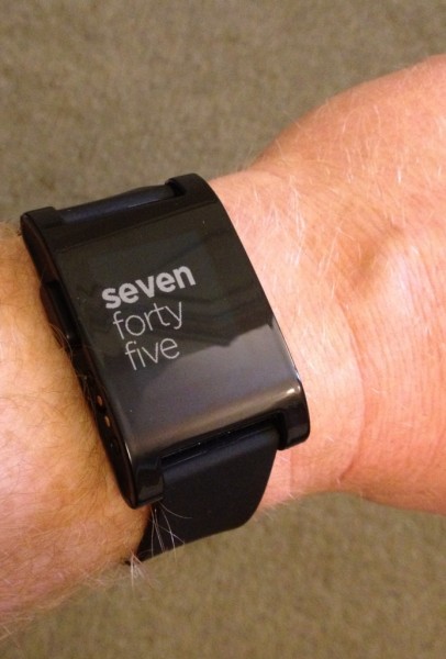
wpid-Photo-17-Apr-2013-0745.jpg

I’ve worn it every day since it arrived, and I even created my own watchface for it. It’s been fun, but it’s taken the developers a couple of years to get to the point where notifications are reasonably reliable and the API is easy to use. Many people who bought Pebbles sold them soon afterwards on eBay.

However, the team deserve a lot of credit, I think, for kickstarting (somewhat literally) the whole smartwatch revolution: few people thought watches were really in demand any more until they proved, rather dramatically, to the contrary, by being the biggest Kickstarter project ever. The upcoming Pebble Time looks nice, too, and it’s worth pointing out that you’ll be able to buy it for about the same price as some of the standard straps for the Apple watches. I think it could be a good option if you want to explore this whole smartwatch thing, especially if you don’t own a recent iPhone (on which the Apple Watch depends).

The Pebble, despite its quirks, has taught me some interesting things.

One is that the wrist is a very convenient place for a user interface. Avoiding the need to take my phone out of my pocket is a great benefit; I can dismiss incoming calls in a couple of seconds, for example, if they occur in the middle of a meeting – much less disruptive. About a year ago, I did it without thinking in the middle of giving a talk, and almost got a round of applause from the audience!

Another is that I use my Pebble many times a day, but very few of those are actually about telling the time. Watches were important for that purpose in the past, when you had to keep checking them to know whether you were getting close to your next appointment. But I’ve long since relied on my devices to notify me in advance of any upcoming events, and I spend much of my time sitting in front of a screen with a clock in the top right corner, or driving a car with a clock on the dashboard. Actually looking at a watch to discover the time is probably something I do about once every other day. So, yes, I’m about to buy my most expensive timepiece ever, when I’ve discovered that I don’t really need a watch for telling the time any more.

Actually, to my surprise, my number one use of the Pebble has been to stop and start audio. I’ve described in a previous post how I listen to large numbers of audiobooks and podcasts, and I seldom do this through headphones. Being able to pause a book from the other side of the kitchen just before I start the noisy coffee grinder is exceedingly handy. Being able to do so with a couple of button presses when I’m out walking the dog in mid-winter and wearing gloves is even more so. While driving, I’ll often stop and start music this way, because reaching my wrist is more convenient than reaching the controls on my dashboard, and so on. This bit of my Pebble’s operation has always been very reliable, perhaps because it’s operating simply as if it were the pause button on a traditional Bluetooth headset. As with every device, in my experience, it’s when you start doing complex Bluetooth LE stuff dependent on background apps that reliability becomes an issue.

Now, I don’t expect audio control to be quite so easy with the Apple Watch, since there is no single, eyes-free sequence of physical button presses that will do it. Using the screen won’t be so easy with gloves on, either. On the other hand, you can just lift up your watch and say ‘Hey, Siri – pause!’ But the key point is not that audio control is the reason to buy a smart watch – it’s that you won’t know what you’ll use it for until you get one. I know now that having controls and a screen on my wrist is a valuable thing, and that’s why I’m buying an Apple Watch, and would do so even if it didn’t offer telling the time as one of its functions!

So, yesterday morning, as soon as the pre-ordering opened, I went online and started planning my order. Delivery times were still quoted as the end of April. Then I paused, cancelled it, went upstairs to get my debit card, came back down and started again, by which time the first batch were sold out and delivery had slipped to May. Sigh. Ah, well, my birthday is in May. I ordered two different watches, actually, on the basis that, once I’d actually seen them in the store, I’d cancel the one I didn’t want. A couple of hours later, almost every model was listed as shipping in June, so I’ll still have some early-adopter street cred. (A friend suggested recently that ‘early adopter’ was something of a perjorative term now, and I should call myself a ‘trailblazer’ instead.)

I quickly jumped over to my local Apple Store’s site and booked a try-on appointment, then headed into town. There was actually much less chaos in the store then I’d expected, perhaps because it was a Friday morning and most of the honest hard-working people of Cambridge had real jobs to go to. So I got to spend nearly an hour trying on different straps and watches, and playing with the software.
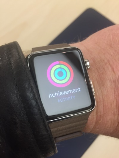
q_apple_watch

If you want general details, there are more reviews online than you could possibly read, but here are some of my early impressions:

  • First, the watch is beautifully made. This is no surprise from Apple, and you’d expect it for the price, but I was still struck by it. It feels slimmer on the wrist than the somewhat bulky impression given by the photos. The display is amazing – clear, high-contrast, easily readable: it makes the Pebble look very limited in that respect, though I haven’t tried it in bright sunlight. Reading even a normal text message on the old Pebble is a bit trying, but scrolling through longish emails on the Apple was just fine. And I’m now at the stage where I normally need to put on reading glasses for things at that kind of distance, so the fact I found it worked well without them even when displaying things like maps is a real testament to its clarity. And hey, displaying maps on your watch, with a little dot showing where you are! How James Bond is that?

  • The ‘digital crown’ works surprisingly well for scrolling. I was skeptical after seeing the videos, but it is very nice, at least for right-handers.

  • It really is difficult to decide which watch and strap combination you want simply by looking at pictures on line. Apple describe this as ‘our most personal device ever’, and that was reflected in the different selections being made by the cheery group of other enthusiasts who were gathered, like me, around the table. I was surprised to discover, for example, how much I liked the brown leather loop, which went well with my skin colour. (It was also interesting to see the majority of those other trailblazers, like me, removing a Pebble from their wrist before trying on the Apple.)
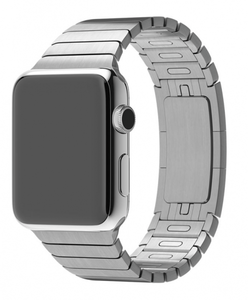
linkstrap

  • The straps are also works of art. Or, at least, works of exceedingly good design combined with excellent manufacture. Some of the prices are outrageous, though: take a look at the link bracelet above, for example. It looks a lot like the straps I’ve had on a couple of previous watches, and it costs £379. Yes, you read that correctly, and no, that doesn’t include the watch. I thought it was a typo when I first saw it on the Apple site. Only when you try it on, do you realise why that price is not quite as outrageous as it first appears. It’s unbelievably slim – much thinner than the photos suggest. The machining is superb. Each link in the bracelet has a clever little catch so you can remove or add them without the need for tools. And the clasp mechanism works beautifully. It apparently takes nine weeks to make. It’s still outrageous, though. I didn’t get one of those.

  • If I were starting now, I think I would buy the black aluminium ‘Sport’ one – it looks better than the silver equivalent, but only if you wear it with a black strap. This limits the options, but combining it with a black leather loop strap would be a fine combination. I didn’t go for that, in the end, because it wasn’t one of my early orders and if I switched I would have to wait another month, but for geeky guys who are less impatient than me, it might be a good choice. The silver aluminium, I thought, looked best with the blue leather loop. A third-party site, mixyourwatch.com, will let you explore the combinations to your heart’s content, and the Click project on Kickstarter should let you use more affordable, non-Apple straps.
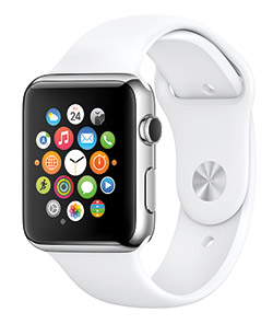
aple-watch-home

  • The icons on the home screen are a bit tricky to hit unless you have more delicate fingers than mine. Not as bad as I was expecting, but I still don’t think it would work very well while I was cycling. You can zoom in using the crown, but I imagine most common apps will be accessed more through swipe-upward gestures than though this screen.

  • The user interface is not really intuitive, I found. But that’s not too surprising, because we’ve no experience of a device with so much functionality in such a small space and with so few physical controls. It’s hard to know where intuition would actually come from. The temptation is to think of it like an iPhone with a home button or a browser with a back button, and it’s not quite either of these. I think it needed a new model of interaction, though, and it will be easy to learn once you’ve played with it for a while.

  • A pleasant surprise, for me, was just how well Siri worked, using the watch as a microphone. This was in a busy and noisy Apple store, yet it was almost flawless. (Note, too, that I didn’t get the opportunity to pair the watch with my phone: the watch has wifi, and Siri is one of the features that works even without the phone being present.) I’m particularly keen on this because I’ve often wanted to use Siri while driving, yet it’s almost impossible through my car’s bluetooth kit. I’m hoping the watch will be a much better way to do this.

All in all, I came away very impressed, and pleased at having got my order in early. The price will be a real issue for many people, and even for enthusiasts like me who might be willing to spend more on a watch that will last for some time – my old Citizen served me very nicely for 13 years before I got the Pebble – this one comes with a big question mark over it: how long will it be before I want to upgrade it?

In the end, though, I paid the money, because I think this will probably last me longer than a phone, should have a good resale value if I want to sell it, and I’m hoping at least that things like straps will be interchangeable with future versions. (If comparing it with the cost of a phone, of course, you need to work out the true cost of the phone once all the months of contract are included, which typically adds a few hundred quid to the label price – there’s no such subsidy for a watch. And your phone doesn’t measure your heartbeat!) But mostly, I bought it because I’ve discovered how much I value having a user interface to my technology on my wrist, and this is, without a doubt, the best available.

If, however, you just want to tell the time, then I recommend Citizen…

Update: John Naughton pointed me at this splendid Alex cartoon.

One for each hand?

About two years ago, I pointed out that iPhones were being born faster than people.

Updated stats from the latest episode of MacBreak Weekly: new iPhones are now being sold at more than twice the global human birth rate.

They can’t keep this up indefinitely!

Keep your Mac disks running smoothly

Hard disks, and the filing systems that run on them, occasionally get confused. This can happen for all sorts of reasons: bugs, power cuts, software crashes, hardware glitches, to name a few. The advent of journalled filesystems make these hiccups much less of a problem than they used to be, but they still occur.

As with checking your car tyres, it’s a very good idea to be proactive about checking and fixing any small issues. Often your computer will continue to run just fine, so you won’t know there’s anything amiss, and, indeed, they may never cause a problem, but it’s much better to fix them before they do… otherwise that one broken link might just cause you to lose something important in the future.

That’s why I have an entry in my to-do system for each Mac that we have in the house, reminding me to run a check-and-repair on its main hard disk. These entries reappear automatically 6 months after I check them off. (If your to-do system can’t do that, you might want to think about getting Omnifocus.)

Anyway, on the Mac, you don’t need any special software to keep things ticking over nicely: you can use the standard Disk Utility program to run these checks, which lives in the Utilities folder within Applications. It’ve very easy: just fire it up, and on the left you’ll see your disks, and the partitions on each disk. Select one, and you can check (verify) or repair the disk layout itself, and the permissions of key files within the partition.

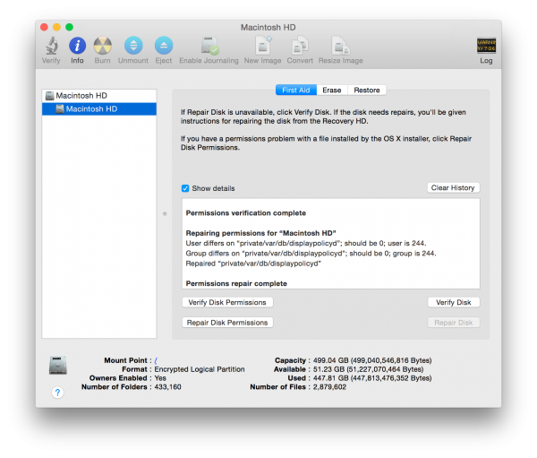
Screen Shot 2015-01-19 at 09.24.15

I never actually bother with the ‘Verify’ buttons: I just hit ‘Repair’, since that will also do a check, and it won’t change anything if the disk or partition doesn’t need repairing. I start with Repair Disk, and then follow it with Repair Disk Permissions.

However, there’s a trick to this…

The system normally can’t do much in the way of repairs on the filesystem from which you’re actually running. So you’ll probably find that the ‘Repair Disk’ button is greyed out, as in the image above, and you’ll need to boot your Mac from another disk or partition in order to run them. Ah.

Fortunately, however, on recent versions of Mac OS X, this is trivial to do, because you also have a hidden ‘Recovery Partition’ on the disk, from which you can boot in order to recover from serious problems, reinstall the operating system, restore from backups, etc. And Disk Utility is available there. What’s more, it’s a good idea to run it from the Recovery Partition anyway, because you’ll have nothing running in the background and trying to do backups, sync with Dropbox, or whatever, while you’re doing the check.

So, reboot your Mac. Normally, if you hold down the Option/Alt key while it starts up, you’ll see a list of places from which you can boot. On Yosemite, however, this probably won’t show you the Recovery Partition, so you need to know a new keystroke: Cmd-R. Hold that while booting, and you’ll get a menu from which you can run Disk Utility. Run your checks, which normally only take a few minutes, then quit the utility and the parent menu, and you can reboot back into your normal, happy, healthy world.

One last wrinkle. If you use FileVault to encrypt your disk, which I’d recommend at least on a laptop, then you’ll need to give your FileVault password before Disk Utility can open the partition and run any checks on it. Just select the partition and click the Unlock button in the toolbar, type in your password and you’ll be ready to go.

Regular, scheduled, proactive checks will help keep your Mac happy and healthy!

To Siri, with love

Judith Newman’s delightful article in the NYT describes how Apple’s speech-recognition software is helping her autistic son to communicate.

The march of progress

progress

One of the things that has always been a challenge for developers is the ‘progress bar’. It can be very difficult to predict in advance just how long something is going to take: you work it out for, say, a typical operating system update on the typical machine and then you find that some users have 100,000 things in their Trash, or are in the midst of a backup to a slow external drive, or whatever…

Installing Mac OS X Yosemite this morning, the progress bar sat at ‘About one minute remaining’ for well over half an hour, so I went and did some Googling and found that I was not alone – many people waited much longer than that, but it always completed in the end. Of course, like a watched pot, it will never get there if you’re sitting waiting for it, so you have to go and do something else. Usually, it is just a mild annoyance for impatient enthusiasts like me, but occasionally it can be a more serious problem if you’re told something will take 30 mins, for example, and you therefore assume you can do it before your appointment in an hour’s time.

Anyway, watching the slowly-progressing pixels gave me an idea…

There are tens of millions of people who will be going through this process over the next few months: surely you could improve the accuracy of their progress bars by uploading the timing information at the end of each installation, along with basic information about the system and then using that to give more accurate estimates to those with similar machines, similar disk usage, etc?

MailMate

For the last few months I’ve switched over to using MailMate as my main email app on the Mac. Alternative mail programs are not very numerous, partly because, overall, Apple’s default one does a remarkably good job. I’ve always rather liked it.

MailMate has a few quirks, and is still in development. (Hint: Turn on ‘Experimental features’, and under Software Update hold down Alt while pressing the ‘Check Now’ to get the very latest version. This sounds dodgy, but I’ve had no reliability problems.)

Overall, I love it. Here are some of my favourite features:

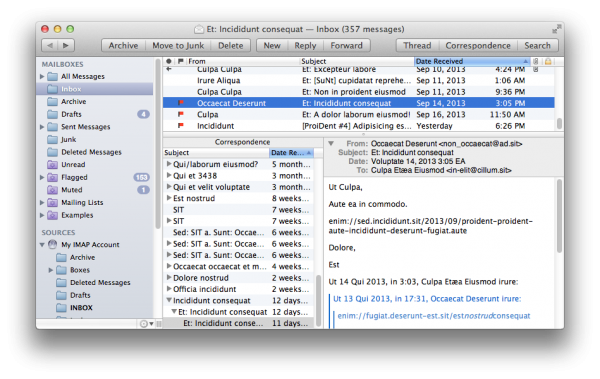
  • I like the ‘correspondence mode’ – when you’re looking a message, this extra window shows you all your correspondence with that person.

correspondence

  • I like being able to write my emails in Markdown.

  • It copes well with my 11GB of mail.

  • There are helpful prompts which warn you if you might intend to do something slightly different. For example, you’ve used words that suggest you’re attaching something, but don’t actually have any attachments. Or if you’ve hit reply on a message that originally had multiple recipients: it lists the other people and asks if you really wanted ‘Reply All’?

  • The search facilities are awesome. If you need to find the messages that you sent to Fred, or that he sent to you, before the start of the year, that don’t contain the word ‘invoice’, it’s easy to do.

  • You can save these complex queries as Smart Mailboxes. In fact, every list of messages you see is basically a database query, and you can treat them as pretty much alike.

  • You can rearrange the order of the mailboxes in the list on the left. So if your smart mailboxes are more important than your folder layout on the server, you can put them at the top.

These last two have combined to make the single best feature for me. In the past, I used to mark as ‘unread’ any messages which still needed my attention. The problem was that it was too easy, when skimming through messages on one of my devices, unwittingly to mark things as ‘read’ and never get around to acting on them when I got back home. And shuffling things into different folders was too much hassle while walking the dog; I just wanted a single inbox and a way of noting what was important.

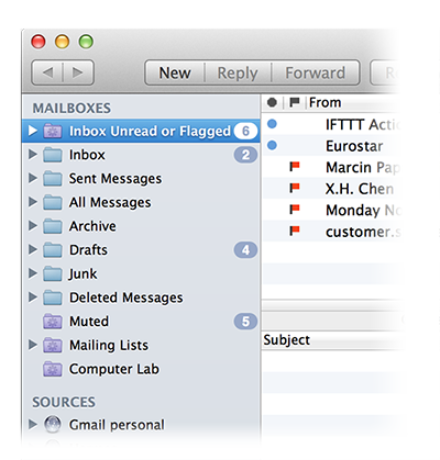
MailMate’s smart mailbox came to the rescue. I now flag messages that need further action, instead of leaving them as unread. My number one mailbox collects the unread and flagged messages from all my inboxes into one place, and doesn’t show anything else.

unread-and-flagged

This is brilliant, because I know that anything I flag, from any program on any device, will appear there, along with any messages I haven’t yet seen. In other words, these are the only things that require my attention. It’s usually a nice short list, and it’s where I spend almost all my time.

MailMate costs $50, which is a hard sell when the Mac comes with a very good email program, and there are free alternatives like Thunderbird. There are a couple of minor features that I miss from Apple Mail, like its handling of images. And it took me a couple of weeks to feel really at home with MailMate.

But there’s a 30-day free trial, and I paid for it long before my time was up. Recommended.

Visualising your Paperless Workflow

On episode 191 of Mac Power Users, (at 32:58) I described how I found it useful to be able to visualise the various steps of my automated ‘paperless workflow’. (Something I also wrote about here on Status-Q last year.)

A few people asked for more details, so here’s a 9-minute screencast going into some of the lower-level stuff.

Also available on Vimeo for the media cognoscenti!

The race is to the Swift?

swiftI love my Mac and iOS devices, but writing native apps for them has always been made somewhat less pleasurable by the programming languages available. Objective-C (which is behind the typical app on your iPhone or Mac) has its merits, or at least, had its merits when it was designed 30 years ago, but things have moved on quite a lot since then. And don’t get me started on the abomination that is AppleScript…
That’s why, amongst the panoply of geeky goodies that Apple announced at its developer conference this week, the thing that interested me most is their new programming language, Swift, which looks rather lovely. (You can find excellent introductory talks about it here.) It’s early days yet, but may be good enough that, henceforward, people will flock to Apple’s development environment because of, rather than despite, the language.

It’s not clear whether Swift will be available anywhere other than on Apple platforms, and there may be a certain degree of deliberate lock-in here. But that’s better than the old situation where Objective-C was available elsewhere, but nobody really cared.

All of which may help to explain why the book The Swift Programming Language had been downloaded by more than a third of a million people within the first 24 hours of anyone knowing the language even existed.

Mac projector hint of the day

Something I’ve just discovered…

If you plug a MacBook Pro running Mavericks into an external display, it will try to select a screen resolution, or offer you a list based on what the display says it can manage.

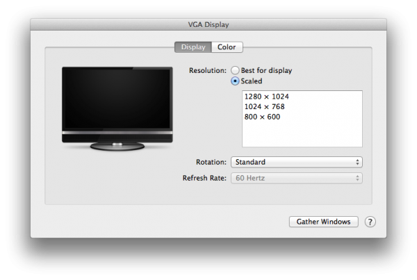
But, particularly if you’re connected by VGA or through some kind of extender, the resolutions offered may be very limited. This is what I got from a reasonably modern TV connected by VGA to my Thunderbolt-to-VGA adapter in a university meeting room:

display_scale

Even when the resolution is high enough, these are all 4:3 aspect ratios and don’t make good use of anything wide-screen.

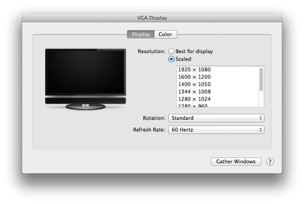
However, if you hold down option/alt and click on the ‘Scaled’ button (even if it’s already selected), you get a whole lot more options:

display_scale2

There’s no guarantee that the screen/projector will be able to cope with any particular resolution selected here, but there’s a pretty good chance, for example, that a modern TV will at least do 1280×768, and that certainly worked for me.

Hope it’s useful!

Breaking good

breaktimeI keep hearing about research that shows how your life will be dramatically shorter and more problematic if you spend too much of it sitting in front of a computer.

Some of this, no doubt, is encouraged by the manufacturers of the standing desks, and even treadmill desks, which are to the young entrepreneurs of today what the Aeron chair was to the dot-com startups of yesteryear.

But whether or not you believe the more worrying claims of reduced life expectancy, I think we can agree that it’s not a bad idea to get up and stretch your legs from time to time. Maybe have a bottle of chilled water, if you’re from California, or a nice cup of tea, if you’re British.

So I’ve been rather taken with a little Mac app called BreakTime, which will pop up and nag you when you’ve been working at your computer for too long at a stretch. You can choose the time periods: mine requires me to have a four-minute break after 56 minutes, for example, and you have some control over how persistent it will be: are you allowed to dismiss it before the four minutes are up? It also makes sensible decisions if you leave the machine of your own accord first, and resets the timer when you return.

I find, to my surprise, that I really like it: I’ve put it on all my machines, and what it highlights is just how difficult it is to keep track of time myself. I’m amazed how quickly an hour of sitting still can fly by when I’m deep in concentration. Even if I do little more than stand up and tidy some things off my desk, I’m sure it’s a good discipline.

There are several other similar utilities out there, but BreakTime works well for me. Recommended.

Update: Tim Green, on Facebook, pointed out Workrave, which does something similar for Windows and Linux. I’m linking to it here because, of course, you can’t search Facebook – even your own history (something I still find incomprehensible).

FCPX 10.1 Media tracking

A geeky post for video editors…

While working on my FCPXchange utility, I did some experiments to see how well Final Cut Pro kept track of files if you moved them around under its feet. I was quite impressed with the results:

Now, exploring a bit further, later, I realised that it can’t be using Spotlight, at least not exclusively, to track the file, because it could still find it even when I put it in a folder explicitly excluded from Spotlight indexing.

And then I realised that all my changes had been moves not copies. If I did anything which involved copying the media and then deleting the original, FCP could no longer track it, whereas, if it were using Spotlight metadata, presumably it could track that in the copy too.

Now, I don’t know much about the deeper workings of HFS+, but I’m guessing that it’s effectively tracking ‘inodes’ here, which means that the same bit of content can be found, whatever name it may have in folders. This, however, will only work with the original copy on the same disk. If you start shifting files around between disks or servers, you’ll thwart it!

iDon’tQuiteWork (yet)

keynoteIn late October, Apple released new versions of its iWork office suite – Pages, Keynote and Numbers – which had all been rewritten from scratch. Upgrading was easy, the new versions were free, and so lots of people hit the download button, myself included. The apps are pretty, with a nice simplified layout, and are designed to match the iOS versions very closely – with full document compatibility.

Now, I’ve been a big fan of iWork for a while. It’s been years since I used Microsoft Word voluntarily, because for most documents I prefer Pages. Keynote leaves Powerpoint way behind – haven’t used that for years either. Excel, though, is still definitely superior to Numbers, if you’re a power-user, but for simple stuff I prefer Numbers too.

However, with these new versions, there were issues, basically because many features had not yet been rewritten, and hence were just left out. Uproar ensued. The first thing I missed was the ability to customise the ‘presenter display’ on Keynote. Rose has just found out how inferior the ‘Export to Word’ functionality is in the new Pages. And a quick glance at the ratings on the Mac app store will give you a whole list of other things that have caused distress to others.

Fortunately, none of this is fatal. If you have iWork’09, the upgrade process doesn’t remove it, and the two versions will coexist quite happily. I fairly soon just put the old versions back in my Dock, and carried on. If you have created any documents in the new packages, you can export them back to the older formats. I guess it may become more tricky over time to buy iWork’09, but it’s not hard to find it on Amazon at present. And finally, Apple have admitted that these new apps weren’t quite fully-formed at birth, and have produced a list of all the bits they’re going to fix in the next few months. Remember, these new apps are not at all bad, and they are free. Many new Mac owners won’t need anything else. It’s just that the old versions were already cheap, and much better. As Joni said, don’t it always seem to be that you don’t know what you’ve got till it’s gone…

This has been quite a publicity disaster. So much of the good will that might have been associated with a high-quality and completely-free office suite has been squandered because Apple didn’t admit beforehand that this was a cut-down version to get started. And you’d have thought they would have learned their lesson by now, because the last thing they did this to was the video-editing package Final Cut Pro – another complete rewrite – which was one of the biggest launch disasters for some time, losing huge numbers of loyal users in the film industry to Adobe’s competing package, Premiere.

But Final Cut is also the thing that gives me hope for the future of iWork. Because over the next couple of years, Apple quietly pushed out update after update – 10 in all – to the point where Final Cut Pro X is now a very fine piece of software, which I’ve enjoyed using extensively in recent weeks.

Rewriting or replacing a major software package is an enormous task, and many companies just don’t have the guts to attempt it. I suspect that, in future, we’ll see that what Apple can do with both FCPX and iWork — because their underlying chassis has been modernised — will give them big competitive advantages. But they need to learn, when they introduce such radical changes, to make it clear that this is not the same as the previous version and to show a development roadmap so users can feel confident about hanging on, rather than jumping ship.

Sadly, it’s not in Apple’s nature to admit, in advance at least, that anything is not perfect. But it’s better to do that than to be forced to admit it in retrospect. The first implies confidence, planning, and honesty. The second implies that you were either dishonest, unprepared or foolish. I wonder if the marketing guys can understand the distinction.

© Copyright Quentin Stafford-Fraser